Yannick
App Store creative assets · 2026
A header should make one idea memorable.
Official Apple header and search illustrations, followed by original design briefs you can adapt to your own app.
Set the scene
Choose the idea a first-time visitor should remember.
Keep the evidence
Connect the artwork to a real capability or content experience.
Check the composition
Preview the placement and verify the focal point survives.
An App Store product page header has a different job from the first screenshot. Start with Apple's official examples below, then use our four original briefs to plan your own composition. The reference images are from Apple Developer; the editorial cover and worked briefs are ours. Neither is presented as a measured conversion winner.
Quick answer
Start with one clear idea, build around a recognizable visual, and let the screenshot sequence provide the detail. Write the brief before choosing the layout. A header that requires several paragraphs to explain probably needs a simpler focal point.
Official Apple header examples
Apple illustrates these placements with Forest Explorer, Airline, and The Coast. The following is the actual reference image hosted in Apple's asset guidance—not an AI reconstruction. Treat the app names and interface as documentation examples rather than independently verified live listings.
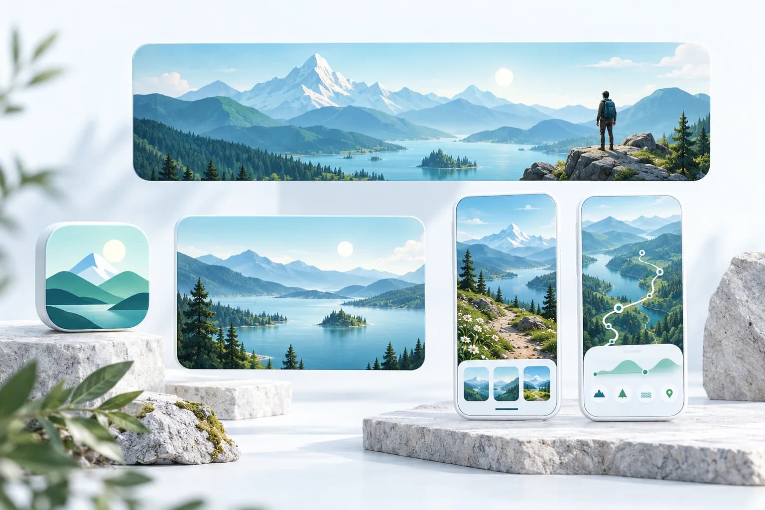
- Forest Explorer: the layered green landscape and tree mark connect the header to the app icon. The artwork establishes an outdoor identity; the screenshots below carry the product detail.
- Airline: a restrained blue graphic introduces the brand without packing the header with controls. The flight-focused screenshots do the explaining farther down the page.
- The Coast: a lighthouse, shoreline, and ship make a specific world recognizable. The same scene can carry into search without substituting a generic game collage.
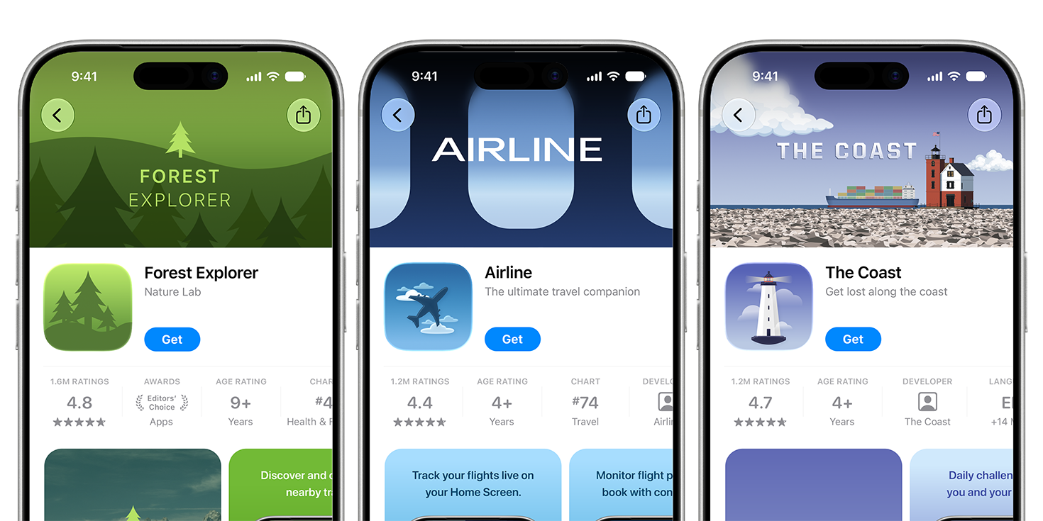
Three official Apple header examples: Forest Explorer's green landscape, Airline's blue graphic treatment, and The Coast's lighthouse scene. Each carries one recognizable identity into the product page.
Source: Apple Developer — App Store asset best practices · View full size
Image © Apple. Apple's documentation illustration, verified October 7, 2026; not a verified live listing, an AppLaunchFlow export, or a conversion case study.
Bring your screenshots and brand materials into the graphics studio to develop the artwork, then validate and publish the final assets in App Store Connect.
Compare the same apps in search
The search versions change the emphasis: Forest Explorer brings in a route interface, Airline adds a phone showing travel information, and The Coast keeps its illustrated scene. The practical lesson is to preserve identity while deciding what the visitor needs to understand at this stage. This is our visual reading of the reference, not performance evidence.
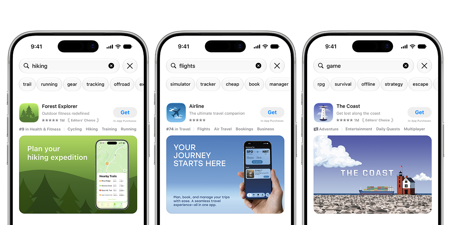
Apple's search examples connect a hiking query to a map-led composition, flights to a travel interface, and a game query to The Coast's illustrated world. Compare the same apps' header compositions rather than treating the two placements as identical crops.
Source: Apple Developer — App Store asset best practices · View full size
Image © Apple. Apple's documentation illustration, verified October 7, 2026; not a verified live listing, an AppLaunchFlow export, or a conversion case study.
Four App Store header concepts you can adapt
Use this table as a creative brief, not as a template to copy without considering your product. Every promise should correspond to functionality or content the visitor can actually access. No concept below has been tested for conversion; the value is a specific hypothesis you can review and measure.
| App category | Idea | Visual evidence | Leave out |
|---|---|---|---|
| Outdoor routes | Find your next nearby adventure | One compelling landscape with a recognizable route detail | A collage of every trail and a long feature list |
| Photo editor | Give an ordinary photo a distinct finish | One genuine before/after edit with a clear split | Impossible effects or artificial results the app cannot produce |
| Language learning | Practice a conversation you will actually use | A relatable scene and one real practice interaction | Flags, badges, and multiple competing promises |
| Puzzle game | Understand the satisfying core mechanic | One representative puzzle state or a readable motion loop | Unrepresentative gameplay and unrelated cinematic art |
Worked brief: a photo editor with a clear transformation
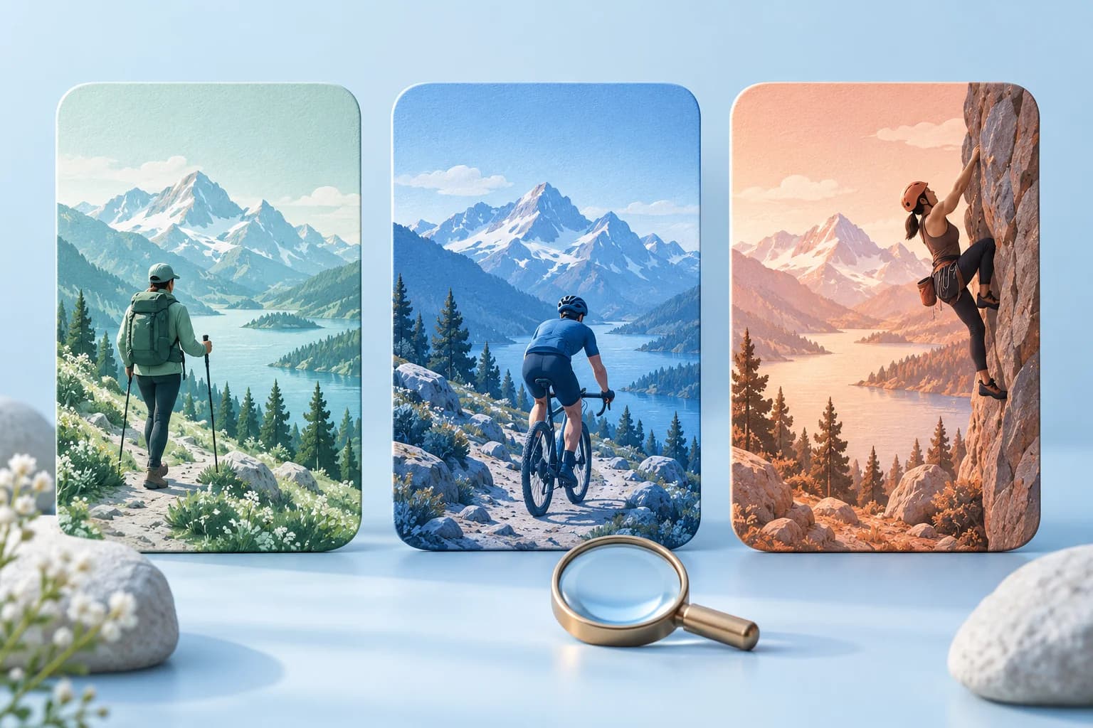
Audience: someone with a useful photo that feels visually flat. Job: improve it without learning professional editing software. Promise: create a distinctive finish from a simple adjustment. Evidence: one photo edited with a genuine preset in the current app. Header: a side-by-side transformation with the subject centered and enough surrounding space for the placement crop.
Use the same photo in a supporting screenshot showing the actual control that produced the result. This creates continuity between the header's promise and the product evidence. A second screenshot can explain fine adjustments. A third can show export. Avoid using a generated showcase result as proof that the app can perform that edit.
For a video, show the real transformation at a pace that can be understood without audio. Hold the result long enough to read, then return smoothly to the starting state. Review the poster frame on its own; it must still express the idea if playback never begins.
Composition decisions for a wide header
A panoramic canvas rewards a strong silhouette, a clear subject, and controlled negative space. Start by viewing the artwork very small: if you cannot identify what matters, removing elements may be more useful than adding a headline. Move supporting texture to the edges and keep the core visual easy to find.
Do not invent a universal safe-area percentage. Work inside Apple's placement template and use App Store Connect Preview to inspect the current crops. If a subject falls outside the useful area, reframe it. When adapting for search, a closer composition may work better than shrinking the entire panoramic scene.
- Review the crop with a first-time user who does not know your app.
- Inspect light and dark regions so the focal point does not disappear on a small display.
- Keep any short phrase readable and prepare a genuinely localized version.
- Do not place important information solely at the extreme edges.
Avoid the banner mistakes that weaken the story
A generic 'all-in-one' claim says little about why an app matters. A grid of unrelated screens makes the visitor perform the hierarchy work. A discount or award badge may look persuasive but introduce review or substantiation problems. Apple's guidance excludes specific pricing, discounts, URLs, other-marketplace references, and unverified recognition from this artwork.
Replace vague claims with recognizable evidence: the finished photo, the planned route, the puzzle interaction, or a representative content scene. If the product has several jobs, reserve the broad story for the default page and develop separate briefs for meaningful audience-specific pages. Do not make every CPP a minor color variation of the same promise.
Turn the brief into a reviewable studio handoff
Collect the current app screenshot, source artwork, brand palette, and one-sentence brief before opening AppLaunchFlow. Develop the composition in the graphics studio, keep an editable master, and record the placement and locale beside each export. Confirm that the chosen preset and downloaded dimensions match the intended upload.
Send a small review package: the artwork, the brief, a placement preview, and the first supporting screenshot. Ask reviewers what they think the app does and what they expect after tapping. Their answers expose a mismatch more directly than asking whether the artwork looks polished. Then upload the approved candidate to Asset Library and inspect it in Apple's preview.
Continue the workflow
Primary sources and verification notes
Platform requirements and software capabilities change. These sources were reviewed for this guide on October 7, 2026; open the current source again before publishing assets, enabling production access, or standardizing a team workflow.
- Apple: asset best practices and templates: Official creative guidance and placement templates; not a promise of conversion uplift.
- Apple: creative asset specifications: The current image and video upload requirements. Check them again before final export.
- Apple: manage your App Store assets: Asset Library, review, placement assignment, previews, and updates to live pages.
Header Examples FAQ
Should an App Store header contain text?
It can, but the visual should remain understandable without a long headline. Keep any phrase short, readable at small scale, and localized. Apple's guidance asks text to enhance the visual rather than explain everything.
Are these Apple's examples or original concepts?
The embedded header and search images are official illustrations hosted by Apple Developer. We have not independently verified those illustrated apps as live listings. The four design briefs and editorial cover are original concepts; none is a customer case study or measured conversion winner.
Can I just crop my first screenshot into a header?
Check whether that crop communicates one clear idea and preserves genuine product evidence. A wide header often needs a new composition, while the screenshot should remain available to explain the interaction.