ASO Guide 2026: App Store Optimization for Keywords, Screenshots & CVR
What actually moves the needle in ASO right now—backed by algorithm updates, conversion data, and psychology research.
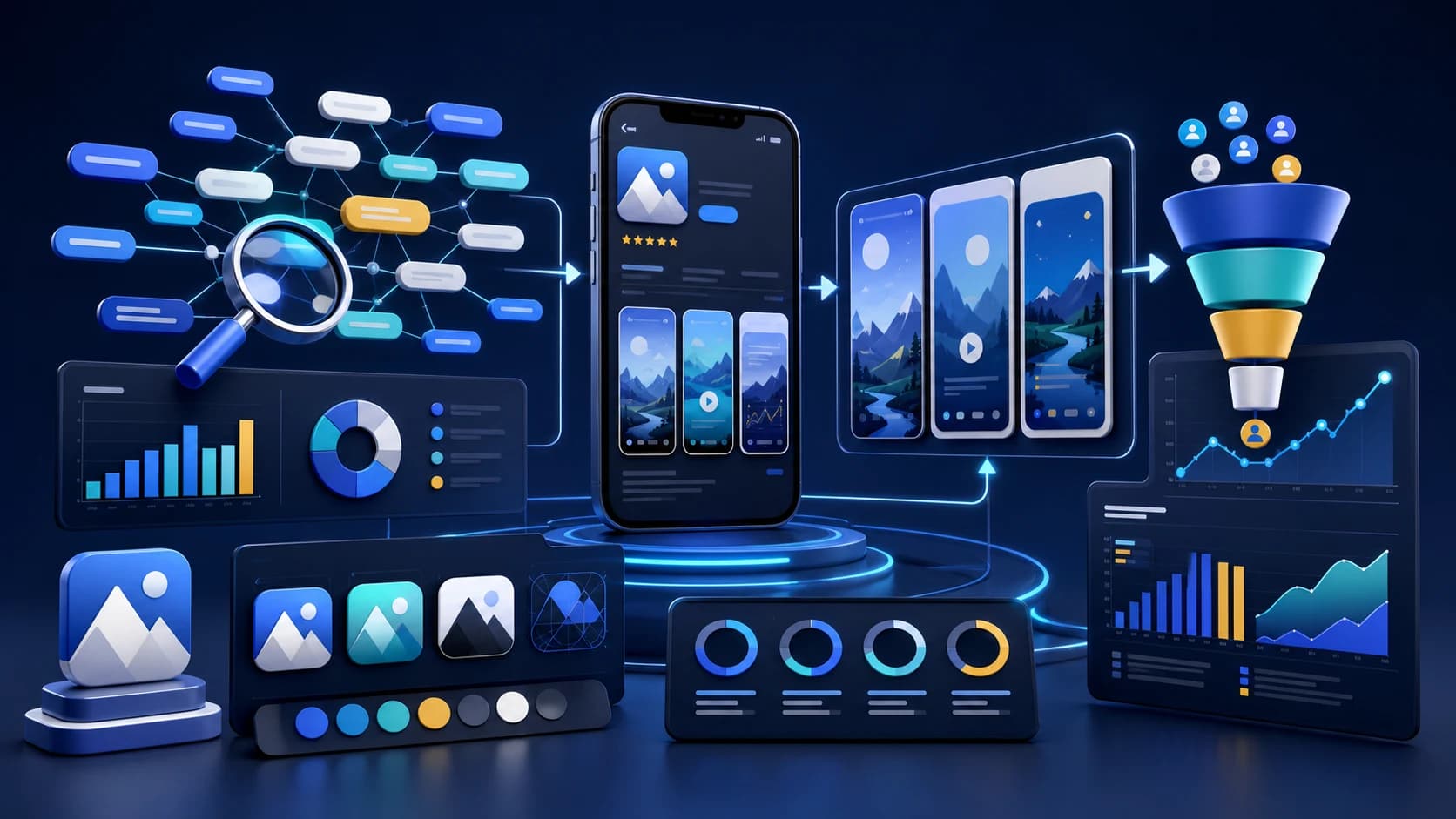
The ASO landscape has shifted dramatically. Apple's algorithm now reads your screenshots. User attention spans have shrunk to 7 seconds. And the psychology of color and shape influences downloads more than most developers realize.
This guide cuts through the noise with data-backed strategies that are working right now in 2026. No theory—just what actually drives downloads.
Consider this the App Store optimization (ASO) guide for 2026—focused on iOS applications, but with principles that still translate to Google Play.
Key takeaways
- Screenshot text is now indexed by Apple’s OCR, so clarity matters.
- Conversion wins come from the first two screenshots and icon clarity.
- Use evidence-backed color, hierarchy, and social proof to lift installs.
- Localize titles and visuals for top markets to capture regional intent.
Fact sheet
- Topic: App Store Optimization (ASO) in 2026
- Coverage: Ranking + conversion strategy for iOS-first launches
- Updated: January 16, 2026
- Companion resource: ASO Copy Generator and screenshot tools
Sources and references are listed in the guide and connected resources.
The 2026 ASO Paradox
Keywords bring users to your page, but screenshots determine if they install. Most developers obsess over backend keywords while ignoring their visual assets—the exact opposite of what converts.
The Algorithm Change That Changed Everything: Apple's OCR Update
Here's the biggest shift most developers missed: Apple now extracts text from screenshot captions using OCR (Optical Character Recognition) and uses it for keyword indexing.
This means screenshots are no longer just for conversion—they're now a discovery signal. The text on your screenshots directly affects which searches your app appears in.
What This Means for Your Screenshot Strategy
Before (2024 and earlier):
Screenshots = Conversion tool only
Now (2026):
Screenshots = Discovery + Conversion
Stop using fluff captions. Phrases like "Easy to Use" or "Beautiful Design" are wasted space. Apple's algorithm reads them but they don't help you rank for anything meaningful.
Use keyword-rich captions instead. "Track Sleep Patterns" ranks you for "track," "sleep," and "patterns" simultaneously. "Build Habits in 21 Days" indexes for "build," "habits," and "21 days."
Contrast is now a ranking factor. If Apple's OCR can't read your text, it doesn't count. Avoid:
- Light text on light backgrounds
- Text placed over busy UI elements
- Decorative fonts that are hard to parse
- Text that's too small (under 40pt on screenshot canvas)
The 7-Second Rule: Designing for Zero Attention Span
Research shows users spend approximately 7 seconds on an app store product page before making a decision. That's it. Seven seconds to convince someone your app is worth downloading.
This has massive implications for how you structure your listing:
The "Billboard" Approach to First Screenshots
Your first screenshot is your billboard. Don't lead with:
- A login screen
- Generic UI without context
- Feature lists (nobody reads these in 7 seconds)
Do lead with: A zoomed-in feature with bold text stating your core value proposition. "Build Habits Fast" or "Track Every Dollar" tells users exactly what they get.
Saliency and the Top-Left Bias
Eye-tracking research reveals users have a strong top-left bias when scanning mobile interfaces. This is where their eye lands first—and often where it stays longest.
Put your core value proposition text in the top-left of your first screenshot. Don't bury it at the bottom or center it where it might get scrolled past.
The Psychology of App Icons: Color and Shape Science
Your icon is the first thing users see in search results, and color psychology affects perception more than most realize.
Color Data: What the Research Shows
| Color | Usage in Top Apps | User Perception | Best For |
|---|---|---|---|
| Blue | 23% of apps | Trust, competence, reliability | Finance, security, utilities |
| White | Most common | Clean, minimal, professional | Productivity, business |
| Purple | Less common | Most "distinctive" and "appealing" | Standing out in crowded categories |
| Green | ~15% of apps | Growth, health, money | Health, finance, eco apps |
The strategic insight: Blue and white are "safe" choices that signal trust. Purple is the breakout color—it's distinctive without being off-putting. If you're in a crowded category, purple might help you stop the scroll.
Shape Psychology: Soft vs. Angular
Users strongly prefer soft forms (rounded corners, organic shapes) over hard, angular designs. This isn't just aesthetic preference—it's psychology:
- Rounded corners feel friendly, approachable, and organic
- Angular shapes feel technical, sharp, and sometimes intimidating
- Even productivity apps benefit from soft forms—they're rated as more "appealing"
This is why Apple pushed rounded corners everywhere. Your icon should follow this pattern unless you're deliberately targeting a "technical/developer" audience.
Social Proof: The 90% Conversion Booster
Here's a data point that should make you rethink your screenshots: Adding social proof elements to screenshots can increase downloads by over 90%.
Social proof includes:
- Media logos: "Featured in TechCrunch, ProductHunt, Forbes"
- User counts: "Trusted by 500,000+ users"
- Rating badges: "4.9 stars from 10,000 reviews"
- Expert endorsements: A quote from a known figure in your niche
Pro Tip: Borrowed Credibility
If you're a small developer without media coverage, use "borrowed credibility." A quote from a real user, an industry expert, or even highlighting your rating can establish instant trust.
Place social proof in your first screenshot—that's where the 7-second decision happens. A badge saying "Editor's Choice" or "500K Downloads" can be the tipping point between install and scroll.
The Hybrid Caption Strategy
The most effective screenshots in 2026 use hybrid captions: text combined with visual cues that guide the eye.
Don't rely on your UI to explain itself—users won't figure it out in 7 seconds. Instead:
- Use arrows pointing to key features
- Add circles highlighting important UI elements
- Include before/after comparisons with visual indicators
- Keep text under 7 words per screenshot—anything more won't be read
Font Size Matters More Than You Think
Check your designs on an iPhone SE screen. If the text isn't readable at that size, you're losing conversions on every small-screen device.
The rule: If you need to squint, you need bigger text.
Keyword Optimization in 2026: What Still Works
While screenshots have become a discovery signal, traditional keyword optimization still matters. Here's what's working now:
iOS: Title + Subtitle + Keyword Field
- Title (30 chars): Your most important keyword + brand name
- Subtitle (30 chars): Secondary keywords or compelling value prop
- Keyword field (100 chars): No spaces after commas, no repeats from title
- NEW: Screenshot text: Keyword-rich captions Apple's OCR can read
Google Play: Everything Gets Indexed
- Title (50 chars): More room than iOS—use it wisely
- Short description (80 chars): Fully indexed, must read naturally
- Full description (4000 chars): Repeat key terms 3-5 times naturally
The ASO Checklist for 2026
Use this checklist before every app store update:
Screenshots
- ☐First screenshot has clear value proposition in top-left
- ☐Captions use keywords (not fluff like "Easy to Use")
- ☐High contrast text that OCR can read
- ☐Social proof visible in first 1-2 screenshots
- ☐Text readable on iPhone SE screen size
- ☐Under 7 words per screenshot caption
Icon
- ☐Uses appropriate color psychology for category
- ☐Soft/rounded forms (unless targeting technical audience)
- ☐Recognizable at small sizes (29x29pt)
- ☐Distinctive from competitors in same category
Keywords
- ☐Primary keyword in title
- ☐Secondary keywords in subtitle (iOS) or short description (Android)
- ☐Long-tail variations included
- ☐Screenshot captions align with keyword strategy
Common Mistakes That Kill Conversions
- Leading with a login screen: Nobody wants to see authentication before they know what your app does
- Generic captions: "Easy to Use" and "Beautiful Design" waste valuable OCR-indexed space
- Low contrast text: If Apple can't read it, it doesn't help your ranking
- Ignoring localization: Most apps only optimize for English, leaving massive markets untapped. Check our localization comparison tool to see how top apps adapt.
- Set it and forget it: ASO requires ongoing optimization as competitors and algorithms change
What's Next: Preparing for Late 2026
Based on current trends, expect these developments:
- More AI in search: App stores will get better at understanding intent, not just keywords
- Video becoming mandatory: Preview videos may carry more weight in ranking
- Engagement signals: How users interact with your app post-download will matter more
The fundamentals won't change: make your app easy to find, easy to understand, and worth downloading. The tactics evolve, but the strategy stays the same.
Start Optimizing Today
You don't need to implement everything at once. Start with the highest-impact changes:
- Rewrite your screenshot captions to include keywords (OCR update)
- Add social proof to your first screenshot (90% conversion lift potential)
- Audit your icon color and shape against competitors
- Test everything using Store Listing Experiments (Google) or Product Page Optimization (Apple)
Every improvement compounds. An app that's 10% easier to find and 10% more likely to convert doesn't get 20% more downloads—it gets significantly more, because those improvements multiply.
Ready to Optimize Your App Store Presence?
AppLaunchFlow helps you create high-converting screenshots with keyword-rich captions, generate all required icon sizes, and see how top apps localize across markets.
Frequently Asked Questions
Does Apple read text from screenshots for ASO in 2026?
Yes. Apple now uses OCR (Optical Character Recognition) to extract text from screenshot captions and uses it for keyword indexing. This means your screenshots are now both a discovery and conversion signal.
What is the best color for an app icon in 2026?
Blue is the most trusted color (used by 23% of top apps), but purple is rated as the most distinctive and appealing. Choose blue for trust signals in finance/security apps, or purple to stand out in crowded categories.
How long do users spend on an App Store product page?
Users spend approximately 7 seconds on an app store product page before deciding to install or leave. This means your first screenshot and icon need to communicate value instantly.
How can I increase my App Store conversion rate in 2026?
Add social proof elements like media logos or user counts to your first screenshot (can increase conversions by up to 90%), use high-contrast text that Apple's OCR can read, and place your core value proposition in the top-left where users naturally look first.
Related tools
Related Articles
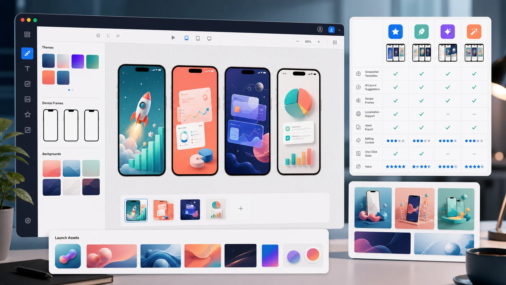
The 7 Best App Store Screenshot Generators in 2026 (Compared)
Compare AppLaunchFlow, AppScreens, Previewed, AppLaunchpad, Shotlingo, Figma, and Canva on AI help, editing control, store sizes, localization, and launch assets.
The 7 Best AI App Icon Generators in 2026 (Honest Comparison)
Compare AppLaunchFlow Icon Composer, Apple Icon Composer, Iconikai, Appicons.ai, Midjourney, Figma, and resize tools on editability, variants, and export quality.
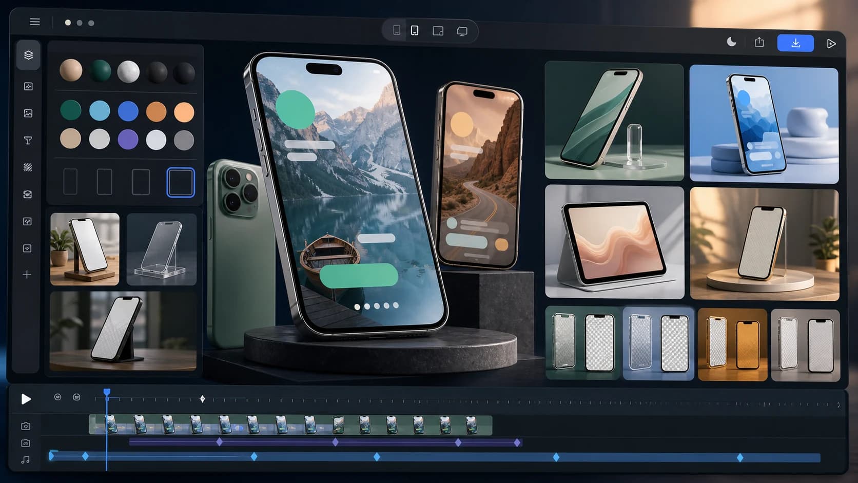
The 7 Best App Mockup Generators for App Launches in 2026
Compare static and animated app mockup tools for launches, including AppLaunchFlow, Rotato, Previewed, Smartmockups, Shots.so, Mockuuups Studio, and Figma.
App Store Screenshot Generator
Create iOS screenshots fast with AI and full editing control.
AI Screenshot Generator
Generate layouts and copy automatically, then refine them your way.
Ready to improve your store page?