Yannick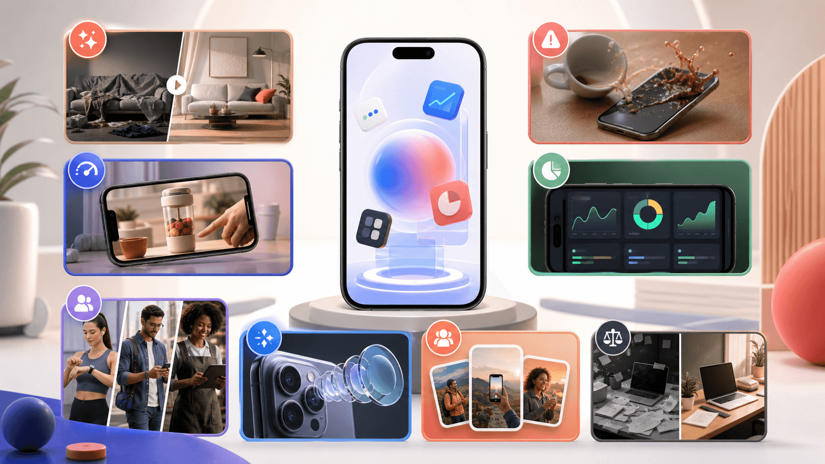
Test ideas, not cosmetic variations
A creative library should cover different reasons to install
Hooks, product demonstrations, proof, and audience context create meaningful variants; a new gradient on the same claim usually does not.
Mine
Collect user language, objections, review themes, activation moments, and competitor conventions.
Concept
Turn each insight into a distinct hook, visible proof sequence, and placement-native composition.
Learn
Name concepts consistently, vary one strategic dimension, and connect installs to downstream quality.
The best app install ad examples are not templates to copy. They are repeatable concept structures: a before-and-after, a live product demonstration, a specific audience problem, social proof, a challenge, a comparison, or a feature-to-outcome story. This guide provides twenty grounded hooks and a test system that respects the way Google App campaigns and TikTok App Promotion assemble and optimize creative.
Quick answer
Build the first creative batch around four genuinely different ideas: a problem-and-result transformation, a real product demonstration, an audience-specific use case, and a proof-led concept. Produce each in the required ratios, with the app shown early and the promise readable without sound. Run variants through a documented hypothesis, measure install quality as well as cost, and replace fatigued concepts with new reasons to care—not only new colors.
Twenty app-install hooks worth adapting
A hook earns attention by making the viewer recognize a situation, outcome, or surprising product behavior. It should be specific enough that the next scene can prove it. Replace each placeholder with language from real users and footage from the current app. Avoid unsupported numbers, fake reviews, artificial scarcity, and competitor claims you cannot substantiate.
The examples below are concept starters rather than predicted winners. Performance depends on the app, audience, offer, placement, market, and downstream experience. Use them to diversify the strategic reason to install, then let a controlled creative plan identify which message deserves more production.
| Concept | Example opening | Visible proof | Best fit |
|---|---|---|---|
| Before and after | From seven loose notes to one plan | Messy input transforms into organized result | Productivity and editing apps |
| Speed demo | Watch this take ten seconds | Uncut core workflow with timer | Simple utility with a fast payoff |
| Audience callout | Solo developers launching this week… | Audience-specific template and output | Niche professional tools |
| Mistake prevention | Don't submit this screenshot size | Invalid asset becomes compliant export | Compliance and workflow tools |
| Outcome first | Your weekly spending, finally explained | Completed dashboard then how it was created | Finance and analytics apps |
| Challenge | Can you solve today in three taps? | Short guided interaction | Games and habit products |
| Proof quote | Localization took one pass | Real attributed review plus translated output | Products with permissioned testimonials |
| Feature reveal | The hidden shortcut in your camera roll | Gesture reveals a differentiated feature | Consumer utilities |
| Myth correction | You don't need a designer for every locale | Editable layout and locale variants | Creator and business tools |
| Workflow comparison | Weekend in a design tool vs. one guided flow | Side-by-side process steps | Automation products with fair claims |
AppLaunchFlow's mobile ad graphics generator turns hooks like these into square, landscape, and vertical ad creatives built from your real app screens, ready for Google App campaigns and TikTok.
Ten more concept structures
Use the next set when the obvious category promise is already saturated: objection answer, new-feature demonstration, use-case montage, day-in-the-life, expert method, template reveal, personalization, progress story, collaboration handoff, and seasonal moment. For example, answer `Will this work with my existing screenshots?` by importing real assets; or show a day-in-the-life where the app resolves one recurring moment rather than listing every feature.
A montage is useful only when every scene supports one outcome. An app with scan, search, share, and export features could tell a single `find any document when someone asks` story. A random feature reel makes the product look broad but gives the viewer no memorable reason to install.
- Objection answer: show the feared limitation and resolve it in-product.
- Template reveal: begin with the polished result, then expose the editable source.
- Progress story: visualize an honest, user-controlled improvement over time.
- Collaboration handoff: show one person creating and another approving or using the result.
- Seasonal moment: connect a current need to an evergreen product capability.
Show the app before attention expires
App advertising can become cinematic enough that the product disappears. Unless deliberate brand storytelling is the tested concept, introduce the real interface in the opening seconds and let it perform the promised action. A device frame can establish context, but the screen must remain large enough to inspect on a phone.
Use touch indicators, zoom, captions, and cuts to guide focus rather than accelerate every action. The viewer is encountering the workflow for the first time. Hold the completed result long enough to understand what changed. If the product effect is invisible—privacy, reliability, or synchronization—use accurate diagrams or captions and avoid inventing an on-screen behavior.
Build concepts that survive automated assembly
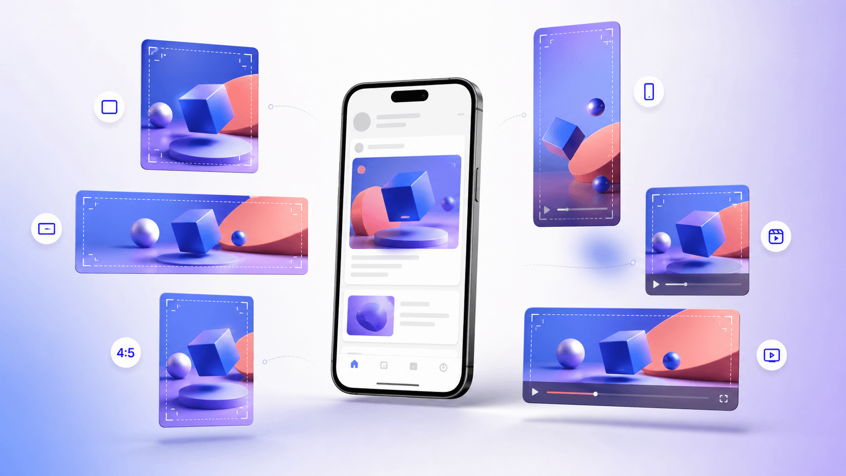
Google App campaigns combine headlines, descriptions, images, videos, and store assets across Search, Google Play, YouTube, Discover, and Display. Google recommends providing multiple assets and warns that content can be cropped, dropped, or modified. Therefore each headline should make sense independently, each image should communicate a complete product idea, and each video should not depend on a particular adjacent text asset.
Provide variety at the concept level. One asset group can include five compliant headlines, but repeating the same benefit with different adjectives gives the system little strategic range. Match concept IDs across copy, image, and video while still allowing any individual asset to stand alone. Keep a record of which combinations the platform served when reporting permits it.
Make TikTok creative native without faking authenticity
TikTok recommends vertical 9:16 video at 720p or higher, sound, content inside the UI safe zone, a strong CTA, and—where appropriate—people such as creators, employees, or customers. It also recommends 3–5 different creatives per ad group. Native does not mean pretending an actor is an independent customer or manufacturing a testimonial; disclose partnerships and use real attribution.
Let a person demonstrate the app in a recognizable environment, speak in category language, and move quickly into the product. Use platform-native pacing and captions while preserving brand truth. A screen-only concept can still feel native when it opens with a direct question, uses vertical composition, and demonstrates one satisfying action without corporate intro graphics.
Design the first test batch
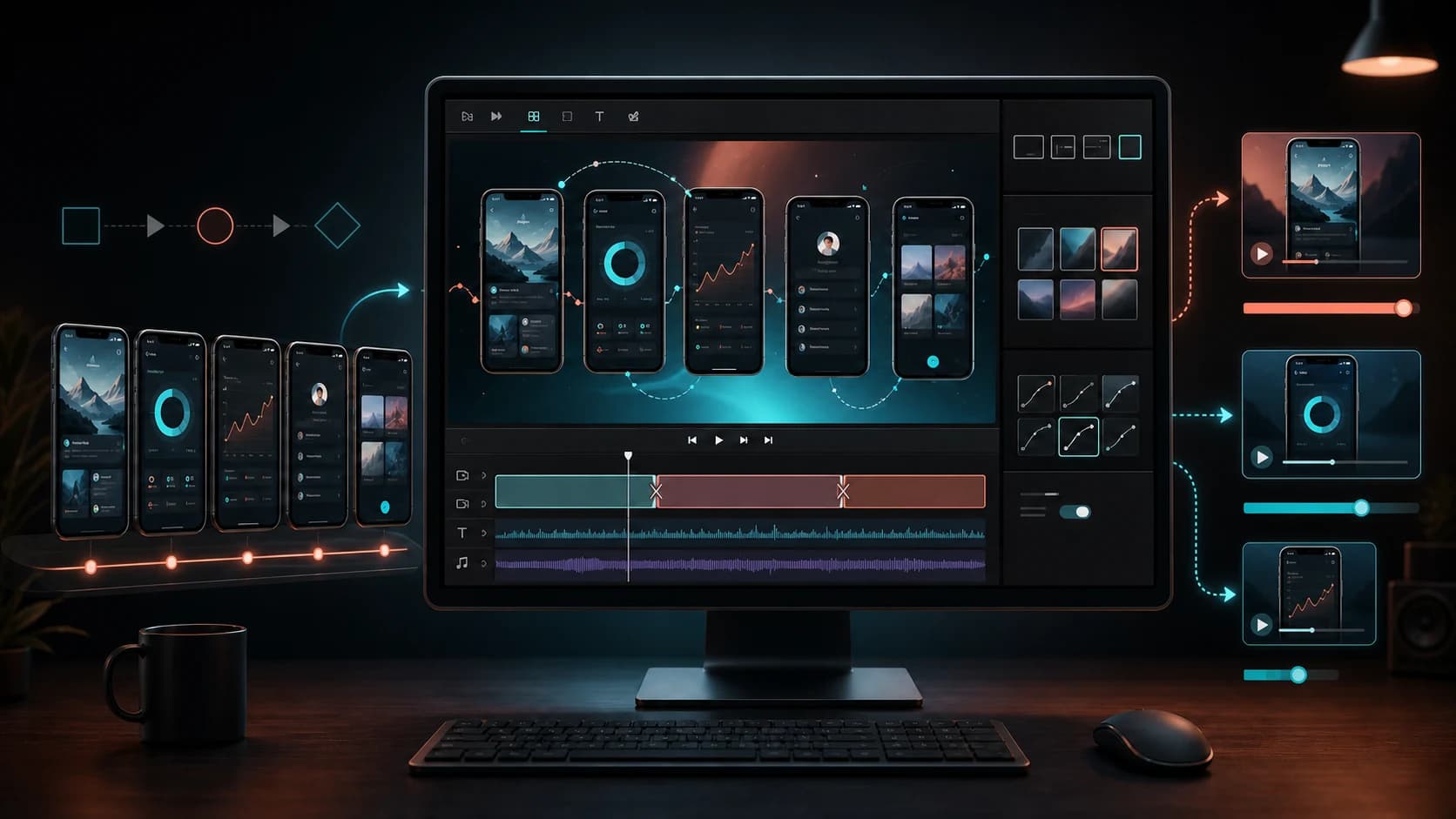
Start with a concept matrix rather than dozens of exports. Rows are audience or problem themes; columns are proof structures such as demo, transformation, testimonial, and comparison. Select four cells that represent genuinely different beliefs about why someone would install. Then adapt each concept to the required placements without changing its strategic message.
Within a concept, a second-round test can change the opening frame, proof order, caption, creator, or CTA. Do not change all of them and call the result a hook test. Pre-register the hypothesis, audience, destination, budget boundary, primary metric, and guardrail. Campaign algorithms change delivery as they learn, so avoid naive side-by-side conclusions from unequal exposure.
Measure quality beyond the install
Cost per install is useful only when the install represents the right expectation. Track first open, account creation, core activation, trial, purchase, retention, or another privacy-safe value signal appropriate to the app. TikTok's App Promotion objective supports optimization toward installs, in-app events, or value where available; Google App campaigns likewise have campaign objectives and measurement configurations that affect delivery.
Creative reporting can show which concept attracted action, while product analytics reveals whether the promise was fulfilled. Reconcile attribution windows and definitions before comparing systems. A cheap concept that attracts curiosity but produces no activation may be less valuable than a narrower ad with a higher install cost and stronger retained use.
Creative fatigue and responsible iteration
When performance declines, first check audience saturation, placement mix, bidding, app-store changes, seasonality, and product issues before declaring creative fatigue. Then refresh the hook, proof, or audience—not just the border color. Preserve winning structural elements so a new concept changes one strategic layer at a time.
Maintain a creative ledger with concept ID, insight source, script, ratios, locales, launch dates, spend window, platform settings, reported outcomes, downstream quality, and retirement reason. This turns advertising into cumulative research. It also helps legal and brand reviewers trace testimonial permission, music licenses, product claims, and the exact asset that ran.
- Four strategically different concepts before cosmetic variants.
- Real app behavior and current store destination in every promise.
- Placement-native composition with protected safe zones.
- Install metric paired with an activation or value guardrail.
- Documented claims, licenses, approvals, and concept-level learning.
Continue the workflow
Primary sources and verification notes
Platform requirements and software capabilities change. These sources were reviewed for this guide on August 16, 2026; open the current source again before publishing assets, enabling production access, or standardizing a team workflow.
- Google Ads: App campaign specs: Current asset counts, sizes, durations, and automated assembly behavior.
- Google Ads: Asset types for App campaigns: Store and non-store creative inputs used across Google inventory.
- TikTok Ads: Creative best practices: Official format, safe-zone, variation, sound, CTA, and creator guidance.
- TikTok Ads: App Promotion objective: Current install, event, value, and retargeting optimization options.
App Install Ad Creative Examples FAQ
What is a strong app-install ad hook?
A strong hook names a recognizable problem or outcome and leads immediately to visible product proof. Examples include before-and-after, speed demo, audience callout, mistake prevention, and outcome-first structures.
How many app-ad creatives should I start with?
Start with about four strategically different concepts, then create the required ratio variants. TikTok recommends 3–5 different creatives per ad group, but the useful distinction is concept variety rather than cosmetic changes.
Should an app-install ad show the interface?
Usually yes. Show the current product early and demonstrate the promised action. If a benefit is invisible, explain it accurately without inventing interface behavior.
Is cost per install enough to choose a winner?
No. Pair install cost with activation, trial, purchase, retention, or another value guardrail so the winning ad also attracts users whose expectations the app can fulfill.