Yannick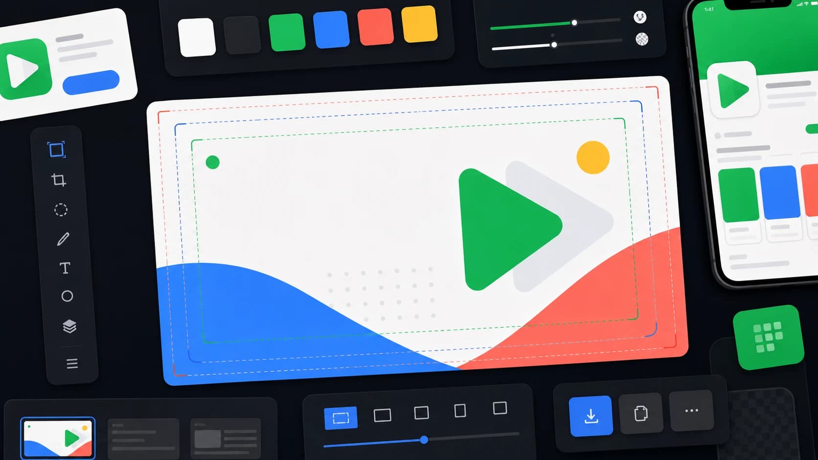
The Google Play feature graphic size is 1024 × 500 pixels, uploaded as a JPEG or 24-bit PNG with no alpha channel. This guide covers the exact spec, the safe-zone layout rules Google's crops demand, the file checks that prevent rejections, and how to export it — by hand or with the free 1024×500 feature graphic generator.
Feature graphic hierarchy
One benefit, one focal point, one safe composition
The 1024 × 500 file may be resized, cropped, or paired with a video overlay, so the central idea must survive without edge-dependent details.
Center
Protect the primary product idea and focal proof in the central composition.
Edges
Use the outer area for background, atmosphere, and non-critical depth.
Export
Deliver an opaque 1024 × 500 JPEG or 24-bit PNG and inspect it at small size.
Feature graphic spec
- Canvas size: 1024 x 500 px.
- Format: JPEG or 24-bit PNG.
- No transparency or alpha channel.
- Use a fully opaque background before export.
- Keep important content away from edges and possible overlay zones.
- Keep the main headline to roughly 5-7 words so it remains readable.
- Show the app benefit clearly without misleading claims or ranking badges.
| Check | Required or recommended | Practical QA |
|---|---|---|
| Canvas | 1024 × 500 px | Inspect actual pixel dimensions after export |
| Format | JPEG or 24-bit PNG | Remove alpha transparency |
| Composition | Critical detail away from edges | Preview at small size and with possible crop |
| Video pairing | Allow for a play overlay | Keep the lower-right area free of essential detail |
| Claims | Accurate and policy-safe | Remove rankings, prices, and unsupported promotion |
How to create the 1024 x 500 graphic
- Create a 1024 x 500 canvas in AppLaunchFlow, Canva, Adobe Express, Figma, Photoshop, or another editor.
- Set the background to an opaque brand color, gradient, product crop, or abstract graphic.
- Place the main app benefit, app name, or strongest UI proof in the center safe zone.
- Use the edges for texture or background only, because Play surfaces can crop or resize the asset.
- Leave the bottom-right area clear if you also use a promo video, since Google can overlay a play button there.
- Export as JPEG or 24-bit PNG, then check the file in Play Console before publishing.
Google Play feature graphic quick answers
What is a graphic feature?
Searchers often say "graphic feature" when they mean the Google Play feature graphic: the 1024 x 500 promotional banner for Android app listings and Play discovery surfaces.
What should an Android feature graphic show?
Show one app benefit, the brand or icon, and a clean visual cue from the product. The best examples match the screenshots and short description instead of acting like a disconnected ad banner.
Which tool should I use?
Use AppLaunchFlow when the feature graphic should match screenshots, social graphics, ASO copy, and launch assets. Canva, Adobe Express, Figma, and Photoshop work for manual custom canvases; ScreenshotWhale, Hotpot.ai, and similar store-asset generators are useful comparisons for one-off templates.
What can cause rejection?
Wrong dimensions, alpha transparency, tiny text, pricing claims, ranking badges, edge-cropped logos, duplicated giant app icons, or important content placed under the promo-video overlay can weaken or block the asset.
What the feature graphic is for
Google uses preview assets such as your feature graphic, screenshots, short description, and video to highlight and promote your app on Google Play and related promotional surfaces. That means the feature graphic should be designed as a reusable launch asset, not only as a file required by Play Console.
The strongest feature graphics make the app category and benefit obvious at a glance. Think of it as a compact billboard: one product idea, one visual system, no clutter.
A safe 1024 x 500 layout
Start with a 1024 x 500 canvas and keep the main product message in the central area. Leave breathing room around the outer edges because Google may crop, resize, or combine assets with other listing elements depending on the surface.
If your listing includes a promo video, keep the bottom-right area clear enough for a play button overlay. Treat the outer edge regions as cutoff zones and reserve them for background graphics, color, texture, or non-critical decorative depth.
Left
Use for brand mark, app UI crop, or a simple category cue.
Center area
Keep the clearest benefit and strongest visual proof here.
Right
Add secondary UI detail or depth, not another full message.
Design rules that prevent weak banners
- Do not paste a full phone screenshot onto the canvas without hierarchy.
- Use one main visual idea instead of a collage of every feature.
- Keep text short enough to survive small promotional placements.
- Avoid a giant duplicate of the app icon; the real icon often appears nearby.
- Use vivid brand colors that stand apart from Google Play light and dark surfaces.
- Avoid misleading badges, ranking claims, pricing claims, or platform confusion.
- Export without transparency and check the final file after compression.
Fast AppLaunchFlow workflow
- Start from your strongest Play Store screenshot or product result.
- Write one short promise that matches your short description.
- Generate a 1024 x 500 feature graphic with enough edge padding.
- Export a JPEG or 24-bit PNG and inspect it at small sizes.
- Use the same visual language across screenshots, icon, and promo video.
Try the Play Store Banner Generator when you need a feature graphic quickly, then pair it with the Play Store Screenshot Generator for a full launch asset set.
Keep the headline and visual promise aligned with the Google Play ASO strategy and the first frames from your Play Store screenshot set. A feature graphic that promises a different use case creates a fragmented listing.
Google Play feature graphic FAQ
What is a Google Play feature graphic?
It is a 1024 × 500 promotional asset used with a Google Play listing and on eligible discovery surfaces. It should communicate one clear product idea quickly.
What file format should I upload?
Export a JPEG or 24-bit PNG with no transparency. Check the final file dimensions and appearance after compression.
Can a feature graphic include text?
Yes, but keep it brief, accurate, and large enough to remain readable when the graphic is displayed smaller than its source canvas.
Should the app icon appear in the graphic?
It can, but avoid making it the entire composition because Google Play may display the actual app icon nearby. Product proof or a distinct visual idea often uses the space better.
Official source
Google documents feature graphics inside its Play Console preview asset guidance and store listing best practices. Review those docs before submission if your asset includes claims, sensitive imagery, or promotional text.