Yannick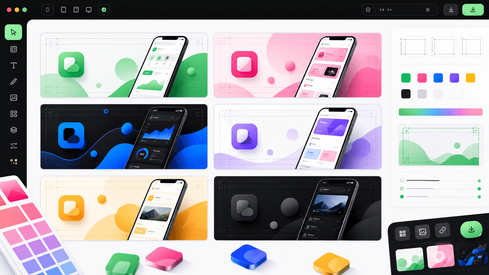
Feature graphic composition
Keep the focal point safe across Play surfaces
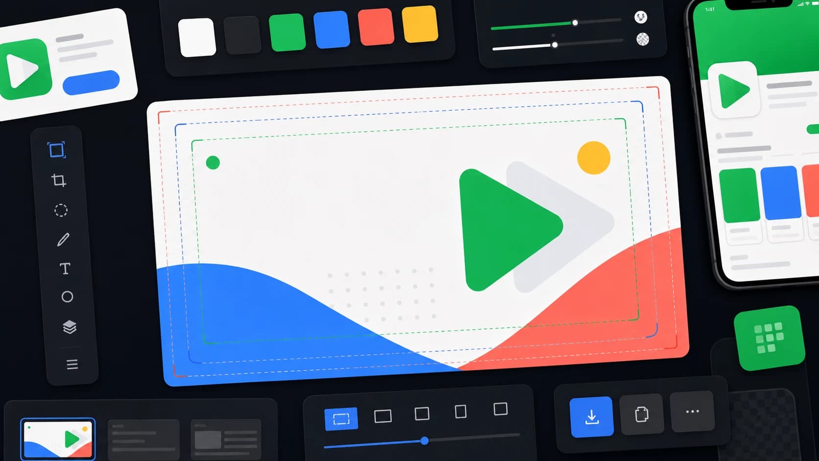
Center the promise
Keep the essential subject and message away from cropped edges.
Reduce fine detail
Design for small placements, not only the full 1024 × 500 file.
Localize the asset
Adapt text and imagery for markets that matter to the launch.
Template ideas
Product UI plus one benefit
App icon plus visual world
Before and after outcome
Seasonal launch variation
Category-specific proof
Minimal brand banner
What Google expects from preview assets
Google describes feature graphics, screenshots, short descriptions, and videos as preview assets that can be used to highlight and promote your app. Requirements are mandatory, while quality guidelines can affect whether assets are eligible for more promotional surfaces.
Examples that usually work
- A clean app UI crop with one clear benefit-led visual hierarchy.
- An icon-led banner for simple utilities where brand recognition matters.
- A social-proof or outcome layout for apps with visible results.
- A localized version where the same composition uses market-specific copy.
- A seasonal variant for campaigns, events, or major product moments.
How to keep templates conversion-safe
Keep claims honest, avoid crowded text, and make sure the graphic matches the rest of the listing. Google recommends localized screenshots and videos for supported languages, and the same thinking applies to your feature graphic when a market is important.
The non-negotiable export rules
Upload a 1024 × 500 JPEG or 24-bit PNG without alpha. Keep the focal point near the center because Google may display the graphic at different crops and sizes. Avoid tiny detail that disappears in recommendation cards, and preview the asset at thumbnail size before upload.
To try any of these layouts without setting up a canvas, the free Play Store feature graphic generator starts every design at 1024 × 500 from your own app screenshots. For safe zones, file checks, and common rejection reasons, see the feature graphic size guide.
Google also advises against icon-like branding that duplicates the app icon, store badges, obsolete device imagery, and promotional claims about rankings, prices, or calls to action. Let the creative explain the product rather than imitate store UI.
Match the template to the product
Official sources
Practical deep dive
Choose a template by communication job
A template is useful when it constrains the composition around one job. Select the pattern from the product evidence you have, not from the style that looks most dramatic in a gallery. The same source file should remain editable for localization, campaign variants, and changes to the product UI.
| Template pattern | Best when | Primary risk | Review test |
|---|---|---|---|
| Product proof | The interface or result is visually distinctive | Tiny, unreadable UI | Can the main proof survive a small placement? |
| Benefit plus brand | The category needs fast explanation | Generic claim without evidence | Does the rest of the listing prove the promise? |
| Character or world | Games and content products have recognizable art | Important detail near cropped edges | Is the focal subject protected in the center? |
| Campaign variant | A launch, event, or audience has a distinct message | Short-lived text baked into the master | Can the copy and locale be changed independently? |
Build the master before the variants
Start with the 1024 × 500 canvas, an opaque background, and a central focal point. Keep critical text, logos, faces, and product proof away from the edges because the asset may be resized or cropped. If a promo video is present, avoid placing essential detail where a play control can cover it.
Create the background, subject, app UI, logo, and copy as separate editable layers. That makes a German headline, a seasonal background, or an updated product screen a controlled change rather than a full regeneration.
Review the graphic as part of the listing
The feature graphic should repeat the positioning of the short description and the first screenshots without duplicating them pixel for pixel. Use it to establish the category and emotional or product focal point, then let screenshots explain the workflow.
Preview the export at small sizes, on light and dark surrounding surfaces, and with the app icon nearby. Remove tiny secondary copy, unsupported rankings, price promotions, or visual details that only work at the full source resolution.
Create a reusable template acceptance checklist
A template passes when the canvas is exactly 1024 × 500, the background is opaque, critical content remains inside the safe composition, and the visual still communicates at a small size. Verify the file format, color, text contrast, claim accuracy, and lower-right overlay risk before it becomes the master.
Test the layout with the longest planned locale and a replacement product image. If either change breaks the hierarchy, the template is a fixed poster rather than a production system. Define maximum headline lines, minimum type size, image-crop behavior, and optional elements inside the template.
Name exports with app, market, campaign, and version. Keep the approved source and final file together. This small operational step prevents an old seasonal graphic or English-only variant from being uploaded during a later release.
Finally, compare the approved graphic with the live short description, icon, first screenshots, and video thumbnail. The collection should communicate one product position even when each asset is encountered on a different Play surface.
Save a small preview beside the full-resolution file so reviewers judge the real communication problem, not only the craft visible at 100% zoom.
Frequently asked questions
What size is a Play Store feature graphic?
The Google Play feature graphic is 1024 × 500 pixels and should be exported as a JPEG or 24-bit PNG without transparency.
What should a feature graphic template include?
Use one clear product idea, sufficient edge padding, an editable visual system, and a composition that matches the app screenshots and icon.
Can I reuse a feature graphic for social graphics?
Reuse the visual direction and editable source layers, but adapt the crop, hierarchy, and copy to each social format rather than stretching the Play asset.
Sources and next steps
Continue with feature graphic size guide, Google Play screenshot requirements, and Google Play ASO guide.