Yannick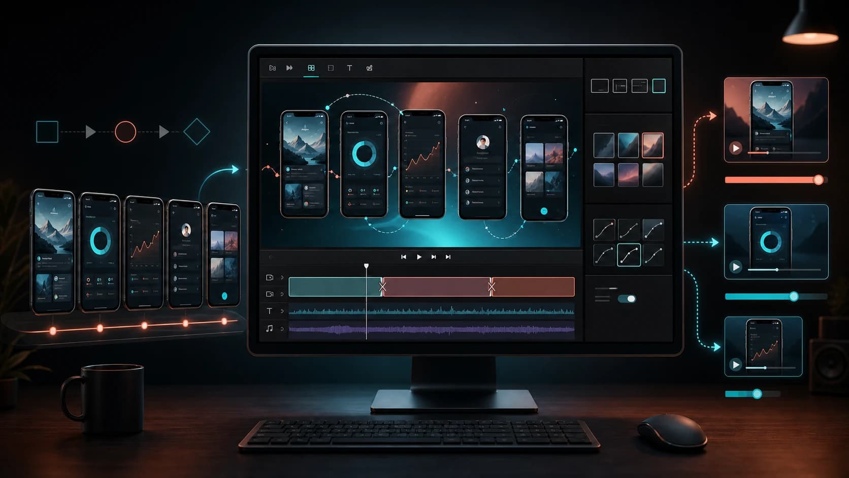
A strong mobile app promo video does not try to explain the whole product. It makes one valuable outcome easy to understand, proves it with recognizable product moments, and ends before the viewer loses the thread.
This guide turns patterns from 15 widely shared app-video examples into a practical production system. You will get a 30-second script, a screenshot-to-video workflow, and separate checks for App Store, Google Play, paid, and social cuts.
The useful default
One outcome, one journey, three cuts
Lead with value
Make the outcome understandable before introducing supporting detail.
Show the path
Use real UI, honest motion, and one complete product journey.
Adapt the master
Create store, 15-second social, and 6-second teaser versions.
What is a mobile app promo video?
It is a short product story made to help a specific audience understand why an app is useful. The term covers App Store app previews, Google Play preview videos, launch-page videos, paid ads, social clips, and sales material—but those placements are not interchangeable.
A store video should behave like product evidence. A social video can open more aggressively. A landing-page video can take longer to explain context. Start with one narrative, then edit it for each destination.
What the best app promo videos do
- Make the audience and outcome clear in the opening seconds.
- Show one workflow instead of presenting a catalogue of features.
- Use motion to direct attention, not merely decorate the screen.
- Remain understandable with sound muted.
- Match the product's emotional pace and visual language.
- Finish with a frame that still communicates value when playback stops.
15 mobile app promo video examples and what to copy
These are pattern studies, not a recommendation to imitate another company's visual identity. Copy the communication decision: how the story frames value, proof, continuity, or emotion.

Example 01
HomebotMake a complicated outcome feel approachable.
Lead with the homeowner's result, then use the interface to explain how the product gets there. This is stronger than opening on dashboards before the viewer understands why they matter.

Example 02
VaultedReduce anxiety by showing the process.
For money, health, and security products, a calm step-by-step flow can be more persuasive than spectacle. Show what happens after the tap and remove uncertainty.

Example 03
TeamSnapConnect the interface to the real-world emotion.
The product is scheduling software, but the outcome is a team arriving prepared. Pairing UI with the physical result keeps operational features human.

Example 04
HeadspaceMake the video feel like the product.
Pacing, sound, color, and motion should reinforce the experience the app promises. A calm product should not be introduced with frantic cuts.

Example 05
PleoTurn an abstract business process into a visible story.
Business software becomes easier to grasp when a card purchase, receipt, approval, and report are shown as one continuous sequence.

Example 06
PerplexityDemonstrate a new behavior in context.
Do not explain an unfamiliar interaction only with claims. Show the question, the response, the supporting evidence, and the next action.
Example 07
Google WorkspaceSell continuity across tools.
When the value lives across several surfaces, use a handoff story. The viewer should see information move between steps rather than watch a disconnected feature reel.
Example 08
ChatGPTMake a broad product specific.
A flexible product becomes credible through one concrete job. Pick a recognizable task and show the complete result instead of listing every possible use case.

Example 09
Beam WalletMake a technical category feel human.
Technical infrastructure is easier to trust when the story begins with a person and a familiar action, then reveals only the product details needed to understand it.

Example 10
BearLet a focused interface carry the story.
A visually distinctive app may need less narration. Careful close-ups, readable interaction, and a small number of transitions can be enough.

Example 11
Alexa ListsShow the complete loop.
Demonstrate the trigger, the synchronized list, and the in-store payoff. Completing the loop prevents the video from feeling like a disconnected demo.
Example 12
Uber for BusinessConnect the tap to the physical result.
The strongest story is not booking a trip; it is getting an employee where they need to go with less administrative friction.

Example 13
WhatsAppSell the relationship, not the messaging feature.
For familiar categories, the emotional consequence can carry more weight than another explanation of buttons people already understand.
Example 14
Slack CanvasPlace a feature inside an existing workflow.
A new feature is easier to understand when the viewer sees what happens before and after it inside a recognizable team workflow.

Example 15
TravelokaMake the transformation the story.
Travel products benefit from a clear before-and-after: uncertainty becomes a booked plan. The interface is evidence for that transformation.
App icons link to the current US App Store listing used to identify each product or its closest named app surface.
Choose the right creative structure
| Product situation | Best starting structure | Proof to show |
|---|---|---|
| One focused utility | Problem → action → result | One complete workflow |
| Multi-tool platform | Job → handoffs → completed outcome | Continuity across surfaces |
| New behavior or category | Context → demonstration → evidence | The unfamiliar interaction in use |
| Lifestyle or wellbeing app | Emotional state → gentle process → payoff | Pacing that feels like the product |
| Technical B2B product | Human task → visible system → business result | A concrete process, not abstract claims |
App Store and Google Play video requirements
Apple App Store app previews
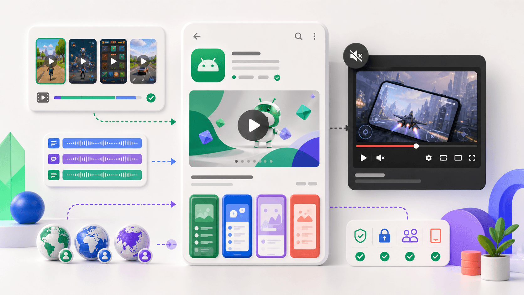
Apple currently allows up to three app previews for each supported device size and localization, and each preview can be up to 30 seconds. App previews appear before screenshots. They should primarily show the app itself, use footage the publisher has the right to display, and stay aligned with the current product and metadata.
Treat the poster frame as a conversion asset because playback is not guaranteed on every surface. For exact containers, codecs, resolutions, and orientation requirements, use the current Apple documentation linked below and recheck it on upload day.
Google Play preview videos
Google Play accepts a public or unlisted YouTube URL as the store listing's preview video. Avoid age restrictions, make the most important material understandable quickly, and verify that the video is playable in every intended market. Google's preview asset rules and surface behavior differ from Apple's, so do not treat one export as universally ready.
A copyable 30-second app promo video script
| Time | Story job | What to show | Caption pattern |
|---|---|---|---|
| 0–3s | Promise | The result or most recognizable product moment | Achieve [outcome] without [friction] |
| 3–8s | Context | The starting screen and audience's situation | Start with [simple input] |
| 8–18s | Method | Two or three connected steps | [Action], then [action] |
| 18–26s | Payoff | The completed output, progress, or transformed state | See [specific result] |
| 26–30s | Recall | A strong final product frame | One short closing proposition |
For a habit-planning app, that might become: “Plan the week you can actually keep.” Show a goal, convert it into three small actions, place them on a calendar, then finish on a realistic completed week. The script sells the transformation rather than the calendar interface.
Turn five screenshots into three useful video cuts
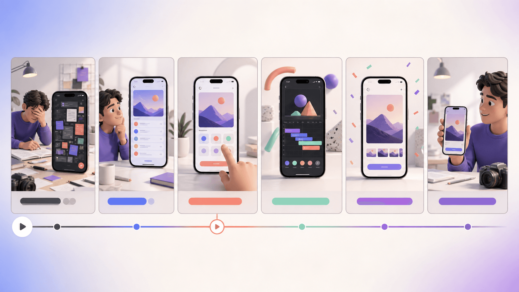
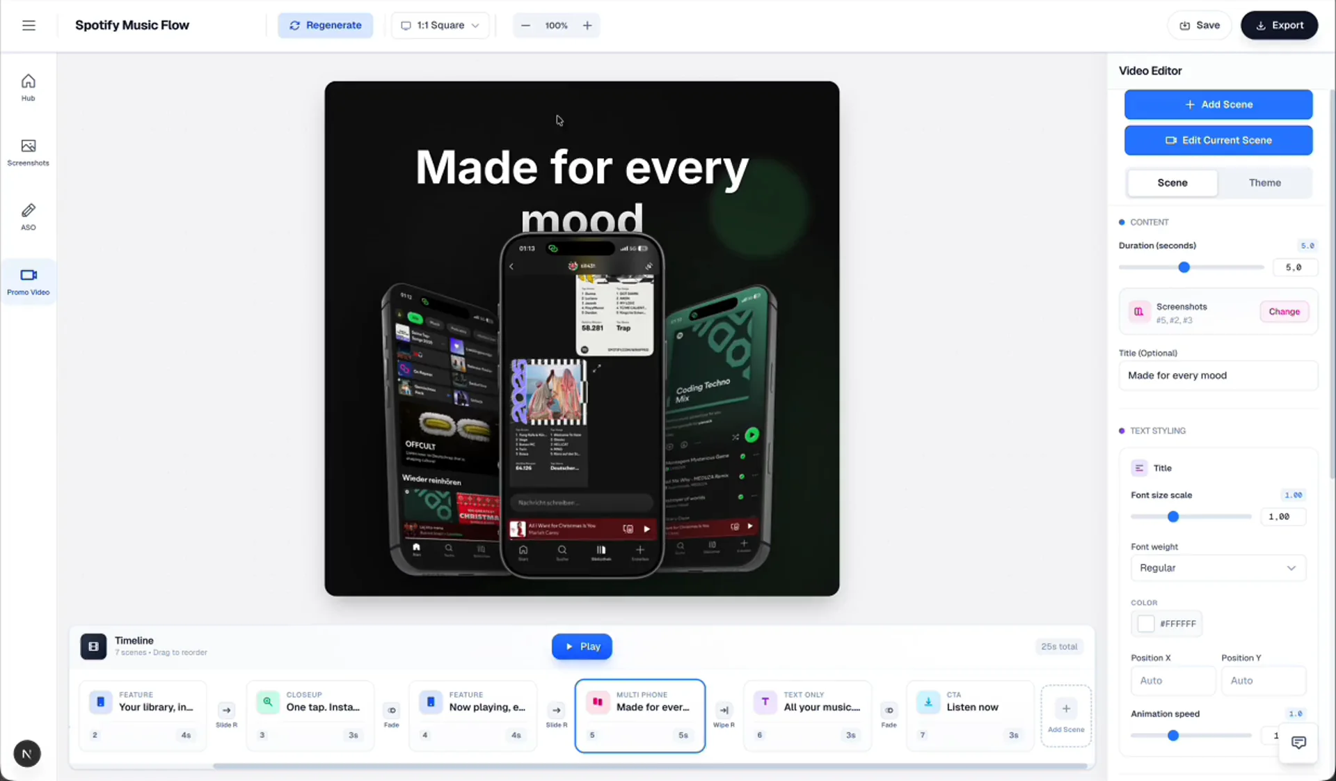
Screenshots are enough when the story depends on states and outcomes rather than a gesture that must be seen in real time. Assign each image a role: promise, starting point, method, proof, and payoff.
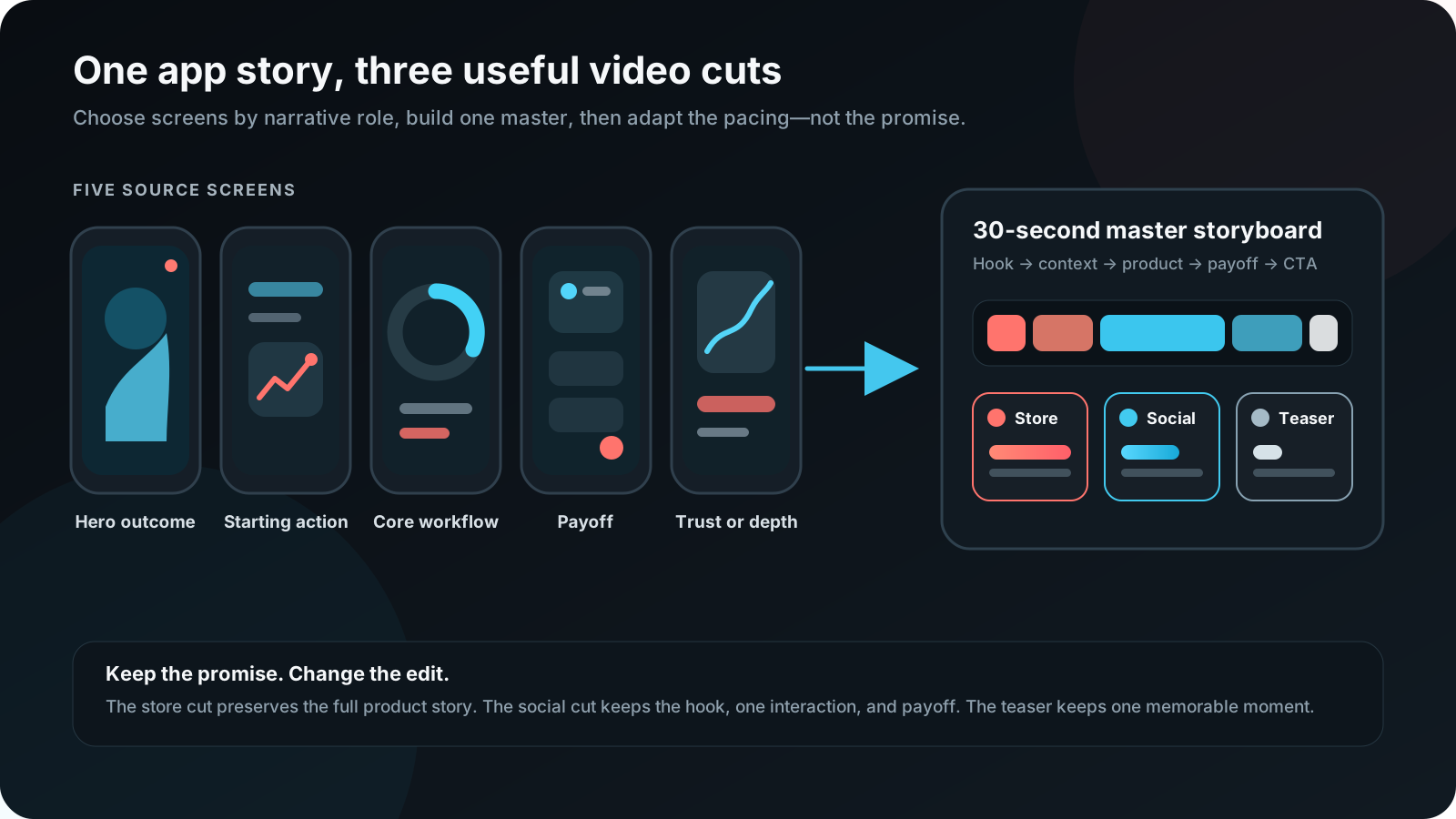
- Choose five screens by narrative role. Do not select five screens merely because they look attractive.
- Write one sentence for each screen. If two sentences repeat the same idea, remove one screen.
- Create the 30-second master. Use enough time for the product state and caption to be understood.
- Make the store cut. Remove claims or transitions that do not behave like product evidence.
- Make the 15-second cut. Keep the promise, one key action, and payoff.
- Make the 6-second teaser. Use one idea and one visual change—not a compressed feature list.
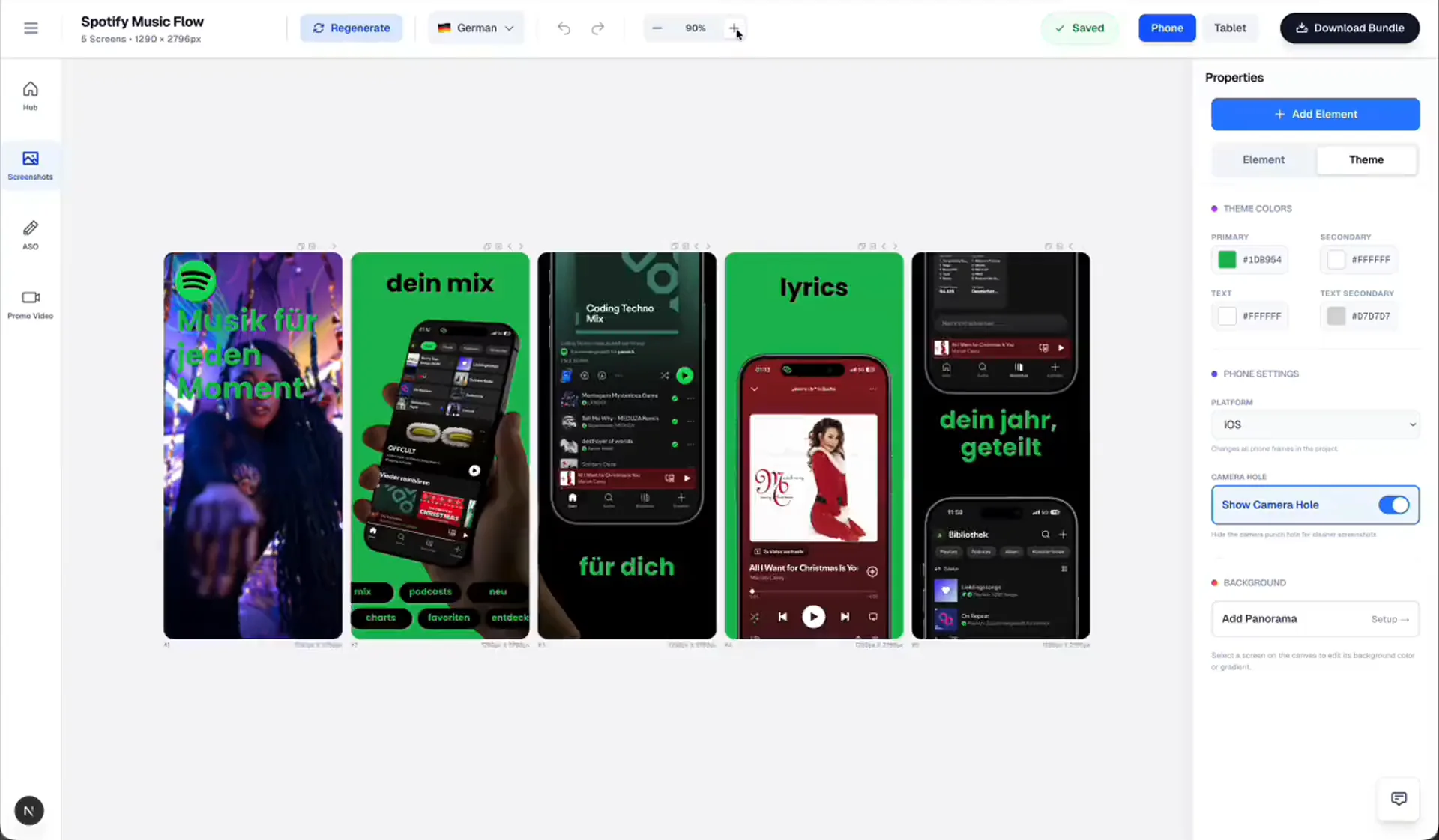
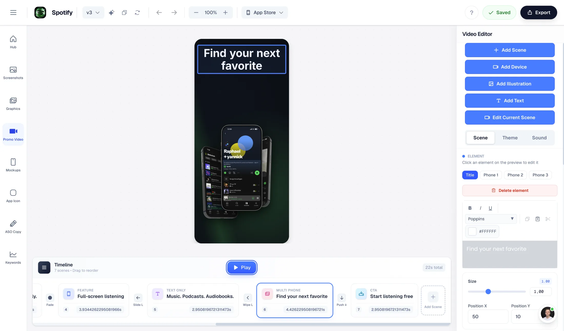
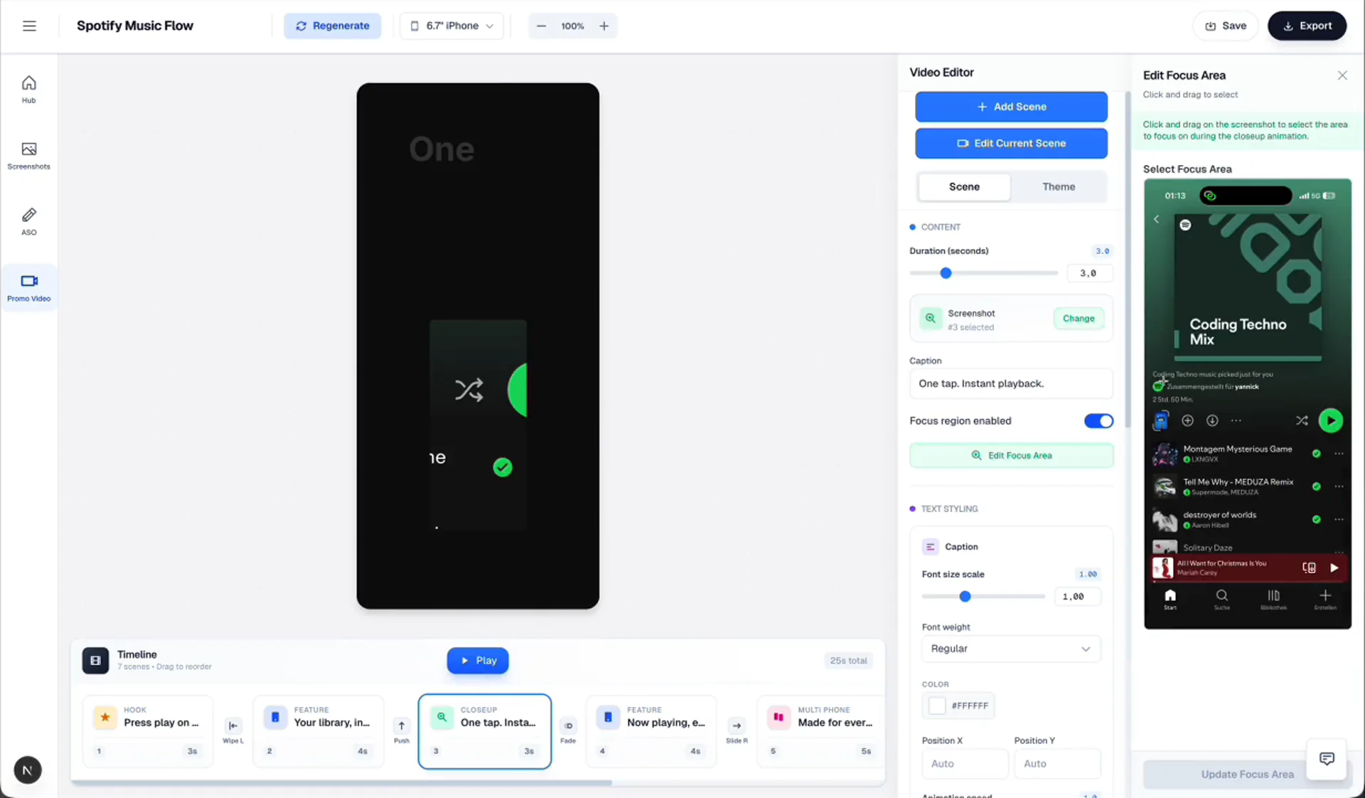
Captions, music, localization, and export QA
Story and accuracy
- Every claim matches a capability available in the version being promoted.
- The audience and outcome are clear without reading the description.
- The video shows one coherent journey rather than unrelated features.
Visual quality
- UI, captions, and touch targets remain readable on a phone-sized preview.
- Motion guides attention and never implies an interaction the app does not perform.
- The opening and poster frame work as standalone images.
Sound and captions
- The story works muted.
- Music and voice rights cover the intended placements and markets.
- Captions do not compete with important UI text.
Localization
- Translate intent, not only words.
- Review localized UI and overlay copy together.
- Allow for expansion and re-time scenes when necessary.
Export
- Review the actual downloaded file from start to finish.
- Check dimensions, orientation, codec, duration, audio, and file size.
- Upload early enough to inspect the platform-processed result.
DIY, promo video maker, freelancer, or agency?
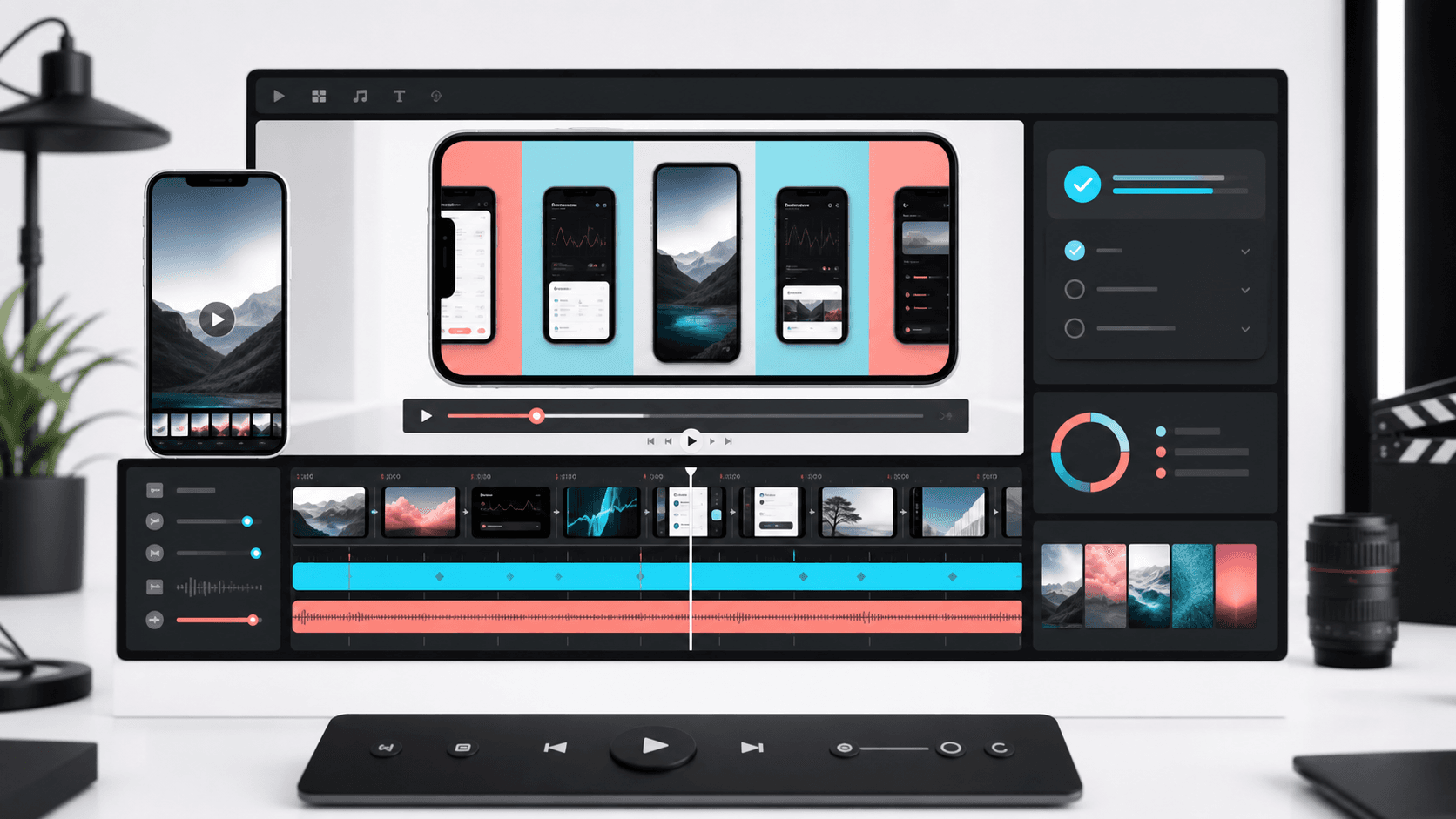
Use a DIY editor or promo video maker when the story can be told from existing screenshots, screen recordings, captions, and device compositions. Hire a freelancer when you need stronger editing, bespoke motion, or sound design but already have a clear brief. An agency becomes reasonable when the campaign requires live action, original illustration, 3D production, many deliverables, or intensive stakeholder coordination.
The production route matters less than the brief. Before choosing a tool or supplier, decide the audience, outcome, evidence, placement, localization plan, and review owner.
Mobile app promo video FAQ
How long should a mobile app promo video be?
Create a 20–30 second master cut for a focused product story, then derive shorter 15-second and 6-second versions for paid and social placements. Apple app previews cannot exceed 30 seconds.
What should appear in the first three seconds?
Show the outcome, product context, or most recognizable action immediately. Do not spend the opening on a long logo animation.
Can an App Store preview include text and narration?
Yes, but the preview should remain understandable without sound, keep text readable, and accurately represent the app experience. Recheck Apple's current review and app-preview rules before uploading.
Does an app promo video need voiceover?
No. Many effective videos use concise captions, interface sound, and music. Voiceover is useful only when it makes the story clearer rather than repeating on-screen copy.
Can I use the same video on the App Store and Google Play?
Use one master story, but prepare store-specific exports. Apple and Google differ in delivery, framing, metadata, and review expectations.
Can screenshots be turned into an app promo video?
Yes. A sequence of five screenshots can become a useful motion story when each screen has a narrative role and motion guides attention instead of pretending the screenshots are recorded interactions.
How much does an app promo video cost?
Cost ranges from a DIY workflow using existing screenshots to a custom agency production. Choose based on how much original footage, illustration, 3D work, localization, and iteration the campaign requires.
Create your mobile app promo video
Start from the screens you already trust. Give each one a narrative role, create the 30-second master, and only then produce the placement-specific cuts. AppLaunchFlow's promo video maker is designed for this screenshot-first workflow, with editable scenes, captions, device mockups, and multiple aspect ratios.
If your store cut is the priority, pair this workflow with the current App Store and Google Play preview requirements.