Yannick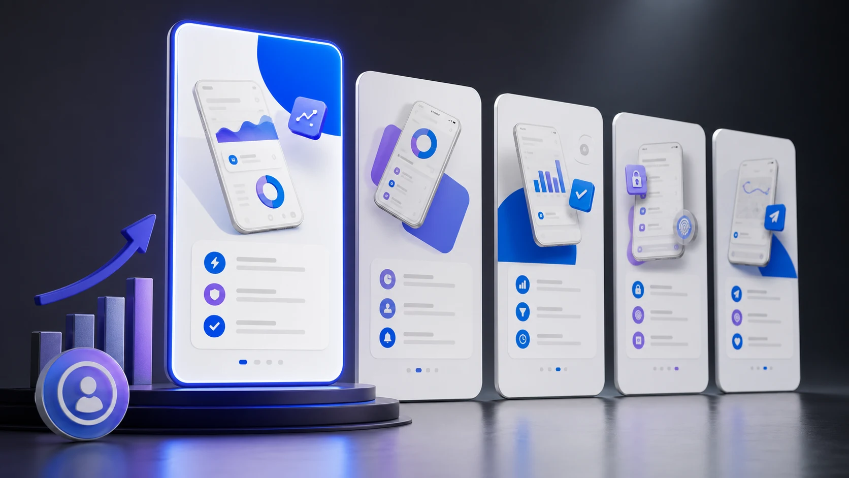
App Store screenshots are not a gallery of everything the product can do. They are a visual argument for why a specific visitor should install. The strongest sets reduce uncertainty in sequence: establish the main outcome, show how it works, prove breadth or trust, and close with the next compelling reason to act. This guide focuses on conversion strategy; use our screenshot specifications guide for exact export sizes and file rules.
Conversion sequence
Make every frame answer one buying question
Why should I care?
Lead with the outcome and audience, not a generic feature label.
How does it work?
Show real product states with enough context to feel credible.
Why believe it?
Use specific proof, breadth, or a differentiated workflow before the close.
1. Design the sequence before styling individual screens
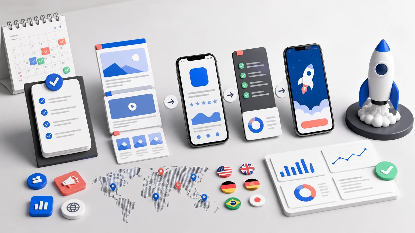
Write a one-line job for each screenshot before opening a design tool. A five-frame sequence might be: promise, core workflow, differentiator, proof, breadth. If two frames make the same claim, combine them or replace one. If an essential objection is unanswered, add the missing evidence. This prevents the common result of five attractive screens that do not build a story.
Prioritize the first three frames because users see them first in many placements. They should make sense as a group without requiring the visitor to open the gallery. Avoid narrative dependencies such as “Step 2” unless the preceding step is guaranteed to be visible.
AppLaunchFlow's screenshot generator builds the whole sequence at once — headline, screen, and device frame for every slot — so you design the story, not five separate files.
2. Write benefit-led headlines that survive thumbnail size
A screenshot headline should name a user outcome or recognizable job. “Track every expense automatically” is clearer than “Smart dashboard.” Keep the line short enough to preserve generous margins and a stable hierarchy across localizations. Read it at the actual product-page thumbnail size; if the message only works when zoomed in, it is not ready.
- Use one primary message per frame.
- Prefer concrete verbs and nouns over “powerful,” “seamless,” or “all-in-one.”
- Do not repeat the same phrase in the app name, subtitle, and first screenshot.
- Keep essential meaning out of tiny captions.
- Match claims to functionality visible in the shipped app.
3. Show the real product without drowning it in UI
Visitors need enough interface to trust the claim, but not every pixel of a full screen. Crop toward the decision-relevant region, enlarge important controls, and use a device frame only when it improves recognition. Do not distort or fabricate functionality. If a frame combines multiple screens, make their relationship clear through scale, alignment, or labels rather than decorative overlap.
Apple allows up to ten screenshots per screenshot set and lets you add up to three app previews per localization and device size. The current field behavior is documented in Apple's platform version information reference. More slots do not automatically improve conversion; use only the frames that add new information.
4. Build a repeatable visual system
Define safe margins, headline widths, device scales, background roles, and type sizes once. Variation should serve the story rather than make every frame look like a different campaign. Use the app's real palette, but assign semantic roles: a surface color, readable primary text, secondary text, a distinct accent, and an alternate high-contrast surface. This creates controlled variety without inventing off-brand colors.
Check contrast against the actual background under each text block, including gradients and screenshots. A theme token is not automatically accessible in every arrangement. When copy crosses screens, keep its position and layer behavior consistent across the full canvas.
5. Design for the category and audience
A finance app usually needs trust and clarity before expressive motion. A game can prioritize atmosphere and characters. A productivity tool should demonstrate the workflow quickly. Study direct competitors to understand category conventions, then choose which convention to follow and which one to break. Do not simply copy the dominant visual style; identify the unanswered user concern that your set can own.
6. Localize the creative, not only the words
Localization may require different line breaks, proof points, cultural references, screen content, date formats, currencies, and even frame order. Give translators screenshot-level context and the maximum useful headline length. Review rendered sets, because a linguistically correct translation can still collide with a phone or disappear against a background.
Use localized product data where possible, and avoid showing a language in the screenshot UI that conflicts with the surrounding headline. See our app localization workflow for the broader release process.
7. Test a meaningful hypothesis
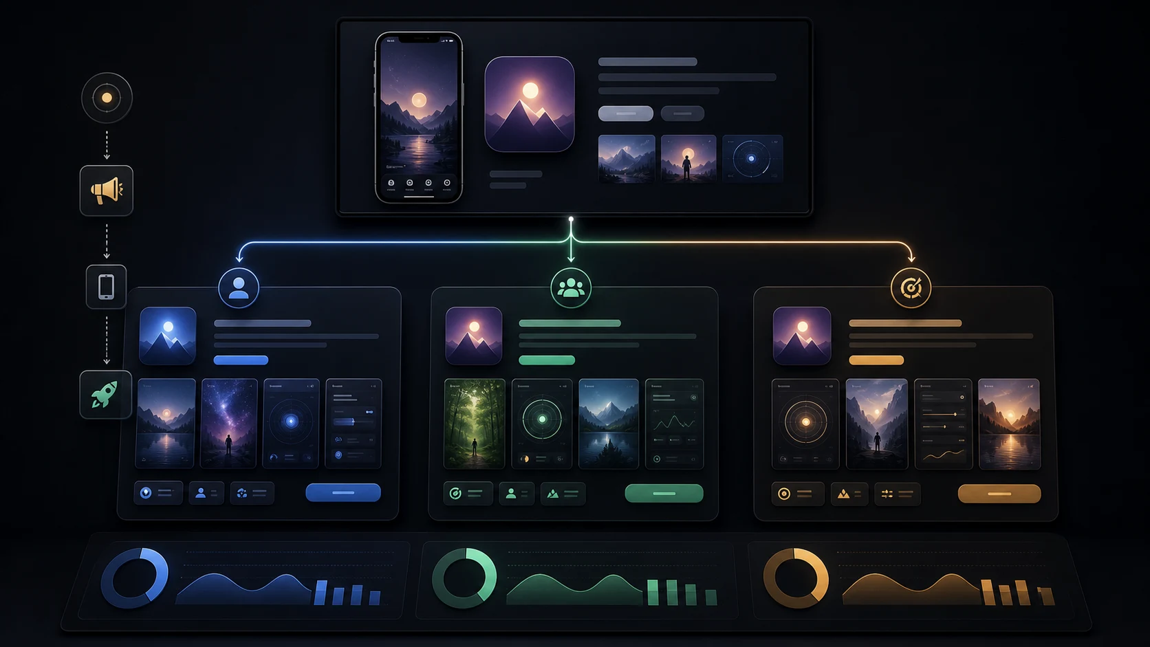
Do not test arbitrary color changes and call the result a strategy. Define a hypothesis such as “leading with collaborative planning will convert team-search traffic better than leading with task speed.” Change the smallest set of elements necessary to represent that idea, maintain all other important conditions, and run the test long enough to interpret uncertainty.
Apple's Product Page Optimization supports tests involving screenshots, app previews, descriptions, and icons. App Store Connect reports conversion rate, improvement, and confidence for treatments. Read Apple's Product Page Optimization documentation before designing the test.
8. Measure the funnel, not only impressions
App Store Connect defines conversion rate as total downloads plus pre-orders divided by unique device impressions. Track impressions, product page views, downloads, and conversion together, segmented by source, territory, device, and page where possible. A set can improve product-page conversion while reducing relevance for a specific search audience, so pair store metrics with keyword and campaign context.
Apple documents the metrics in its analytics definitions. Record the release date and creative version alongside performance so later analysis can distinguish a screenshot change from a featuring event, paid campaign, or product release.
Common screenshot mistakes
- Starting with a logo or generic slogan instead of the product outcome.
- Using paragraphs that cannot be read in search results.
- Repeating the same phone position and message five times.
- Using device frames so large that the relevant UI becomes tiny.
- Showing obsolete product states or unsupported claims.
- Applying one English layout to every locale without rendered QA.
- Changing many variables in a test with no written hypothesis.
Final review checklist
- The first three frames communicate a coherent decision story.
- Every headline is readable at thumbnail size.
- Each screenshot adds a distinct reason to install.
- Real UI supports every claim.
- Text, backgrounds, and controls pass contrast review.
- Localized sets are reviewed as images, not just strings.
- The source files remain editable for future tests.
- The exported dimensions match current App Store requirements.
Practical deep dive
Use a screenshot acceptance scorecard
Best practices become actionable when every frame is reviewed for message clarity, product proof, thumbnail legibility, sequence role, platform accuracy, localization, and measurement.
| Criterion | Pass condition | Evidence | Fix |
|---|---|---|---|
| Promise | One audience outcome is clear | Five-second review | Rewrite the headline |
| Proof | Visible UI supports the claim | Build-to-asset comparison | Replace the product state |
| Hierarchy | Caption and UI survive thumbnail size | Listing preview | Simplify copy and crop |
| Sequence | First frames work together | Story review | Reorder by objection and value |
Review the set before testing variants
Correct inaccurate UI, wrong dimensions, weak contrast, tiny captions, mixed platform frames, and stale localization before interpreting conversion. These are quality defects, not experiment ideas.
Then test a meaningful promise, proof sequence, or visual system for a defined audience. Use conversion as the store outcome and activation or purchase quality as a guardrail.
Frequently asked questions
What is the most important screenshot best practice?
Make the first frame state one valuable outcome and prove it with accurate, readable product UI.
How should screenshots be ordered?
Lead with the promise and core proof, then differentiation, objection handling, and secondary use cases.
Should screenshots be localized?
Yes for priority markets; adapt captions, text fit, product formats, proof, and sometimes order rather than translating a flattened image.
Sources and next steps
Continue with complete screenshot guide, screenshot specifications, and screenshot A/B testing.