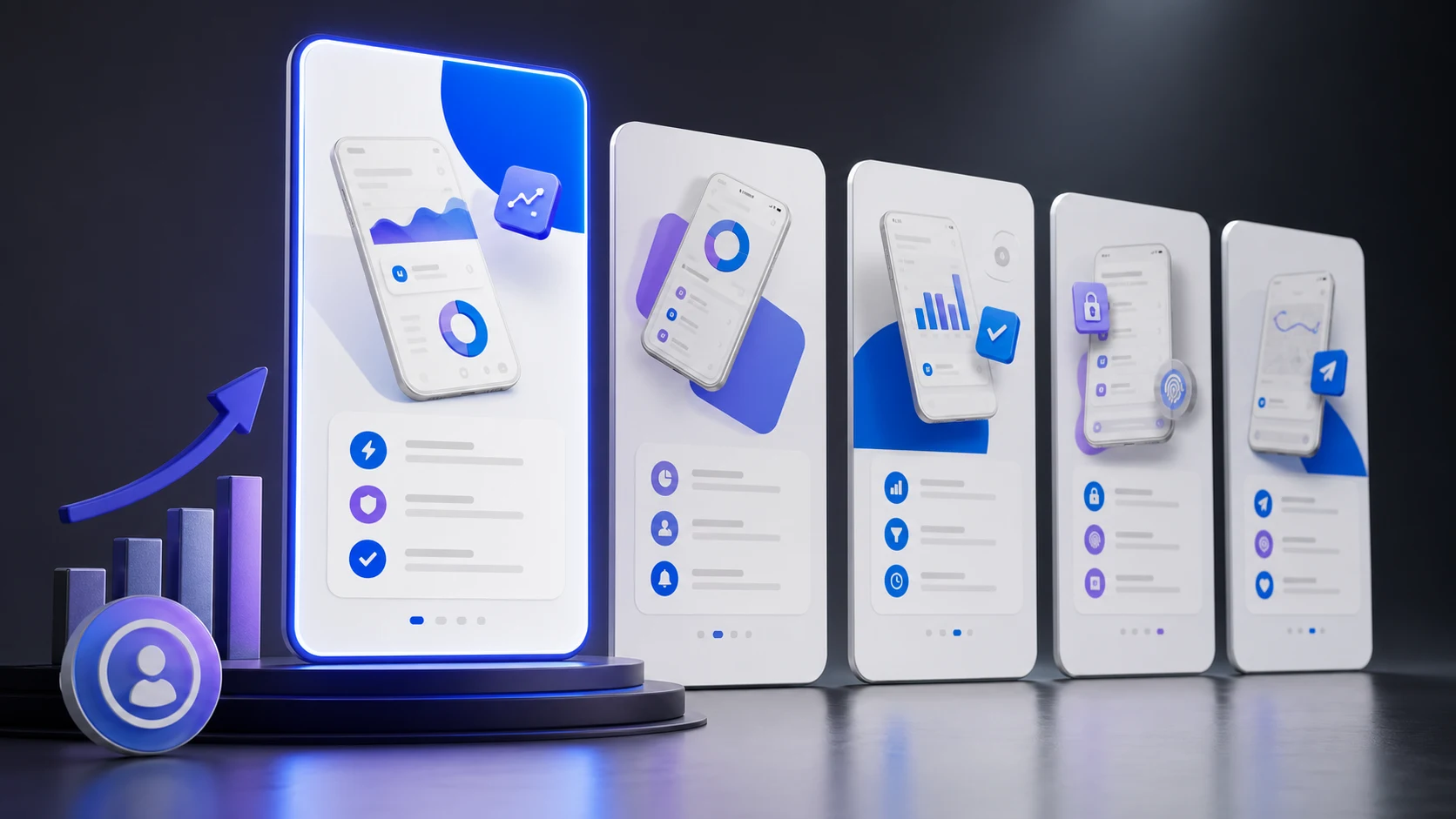
App Store Screenshot Guide: Design Screenshots That Convert in 2026
Learn the proven strategies and best practices for designing app store screenshots that drive downloads and improve your ASO rankings.
Here's a stat that might surprise you: the average user spends about 7 seconds on your App Store page before deciding to download or bounce. Seven seconds. And for most of that time, they're looking at your screenshots.
I've talked to dozens of indie developers who spent months perfecting their apps, only to throw together some quick screenshots at the last minute. Then they wonder why their download numbers are disappointing despite great reviews from the few users who actually gave it a shot.
Your screenshots aren't just "nice to have" marketing materials - they're the main thing convincing (or failing to convince) potential users to give your app a try. Let's talk about how to get them right.
The First Screenshot Rules Everything
Your first screenshot is by far the most important. In search results, it's often the only screenshot visible. On your product page, many users won't scroll past the first two or three.
This first screenshot needs to answer one question immediately: "What does this app do, and why should I care?" If someone can't figure that out in a glance, they're gone.
Don't waste this prime real estate on your logo, a welcome screen, or a generic splash. Show your app doing the main thing that makes it valuable. If it's a budgeting app, show the budget dashboard. If it's a photo editor, show a before/after. If it's a game, show the actual gameplay (not the title screen).
The "Show, Don't Tell" Approach
The most effective screenshots show your app actually being used, not just sitting there looking pretty. Users want to imagine themselves using your app. Give them that.
This means showing real (but curated) content, not placeholder data. If your app has lists, show interesting list items. If it displays information, show information that looks genuinely useful. Generic "Lorem ipsum" content screams "this is just a demo" and subconsciously makes users question if the app is actually finished.
That said, be careful with what content you show. If it's a messaging app, don't show conversations that could make users uncomfortable. If it's a finance app, use realistic but aspirational numbers (people like seeing proof that they could save money, not reminders that they're broke).
Text Overlays: Less Is More
Almost every app uses text overlays on screenshots to highlight features. The problem? Most developers write way too much text.
Remember those 7 seconds? Users aren't reading paragraphs. They're scanning. Your text needs to be punchy - ideally 3-5 words per screenshot. Instead of "Our app helps you track your daily water intake with customizable reminders and detailed statistics," just say "Track Your Water Intake."
Font size matters too. That text needs to be readable on a phone screen, which means it needs to be pretty big. A good rule of thumb: if you can't read your headline when your phone is at arm's length, it's too small.
And please, check your text for typos. Nothing kills credibility faster than a spelling error in your first screenshot. I've seen it happen more often than you'd think.
Device Frames: To Use or Not to Use?
This is a hot debate in the app marketing world. Device frames (showing your screenshot inside an iPhone or Android mockup) can make your screenshots look more polished and help users visualize using the app.
On the other hand, frames take up space that could show more of your actual app. Some of the top apps have ditched frames entirely and just show their UI with background gradients and text overlays.
My take: if your app has a beautiful, distinctive UI, you might not need frames. If your UI looks fairly standard or utilitarian, frames can add visual appeal and professionalism. Either way, be consistent - don't mix framed and unframed screenshots.
The Optimal Screenshot Sequence
Think of your screenshots as a story or sales pitch, not just random screens from your app. Here's a sequence that tends to work well:
- Screenshot 1: Your killer feature or main value proposition
- Screenshot 2-3: Other important features that differentiate you
- Screenshot 4-5: Supporting features or use cases
- Screenshot 6+: Social proof, awards, or additional features if needed
Some apps use "panorama" style screenshots where images connect visually as you scroll. This can look really slick, but be careful - if each individual screenshot doesn't make sense on its own, you lose the users who only see one or two.
Platform Requirements (The Technical Stuff)
iOS App Store
Apple requires specific screenshot sizes based on device displays. The most important are the 6.7-inch (iPhone 15 Pro Max size) and 6.5-inch (iPhone 14 Plus). If you provide these, Apple can scale them for other devices.
You can upload up to 10 screenshots per device size. The first three appear in search results without scrolling, so prioritize accordingly. If you're not localizing, your US screenshots will be shown globally by default.
Google Play Store
Google Play is a bit more flexible but also more specific. You can upload up to 8 screenshots for phones and 8 for tablets. The minimum resolution is 320px, maximum is 3840px, and the aspect ratio must be between 16:9 and 9:16.
Unlike iOS, only your first screenshot appears in most search results, so that first one is absolutely critical on Android.
Check out our store size requirements guide for a complete list of all screenshot dimensions.
Common Mistakes to Avoid
Using raw screenshots without polish: Unedited screenshots of your app look amateurish next to competitors with designed assets. At minimum, add a background color and some text overlay.
Too many features, not enough benefits: "Has 47 features" is not compelling. "Save 5 hours every week" is. Focus on outcomes, not capabilities.
Ignoring dark mode: If your app supports dark mode, consider showing it in at least one screenshot. Many users prefer dark mode and will appreciate seeing that you support it.
Outdated screenshots: If your app has evolved significantly, make sure your screenshots reflect the current version. Users who download expecting one thing and get another leave bad reviews.
Not localizing: If you're available in multiple countries, localized screenshots can significantly boost conversion. Japanese users respond better to Japanese text. German users to German text. It's worth the effort for your top markets.
A/B Testing Your Screenshots
Both Apple and Google now offer native A/B testing for your store listings. Use this. You might think you know which screenshots work best, but real data often surprises people.
When running tests, change one thing at a time so you know what actually made the difference. Test big changes first (completely different screenshot styles or messaging) before fine-tuning details like button colors.
Give your tests enough time to reach statistical significance. A few hundred impressions isn't enough to draw conclusions - you usually want thousands.
The Psychology Behind High-Converting Screenshots
Great screenshots tap into psychological triggers that motivate downloads:
Social proof: "Join 1M+ users" or showing in-app social features makes people feel like they're joining something successful.
Fear of missing out: "Don't miss another deadline" or highlighting what problems your app solves creates urgency.
Aspiration: Show the outcome people want. Fitness apps show fit people. Finance apps show growing savings. Dating apps show happy couples.
Simplicity: If your app looks easy to use in screenshots, people are more likely to believe they can actually use it. Cluttered, complex-looking UIs scare users away.
Final Thoughts
Your screenshots are working 24/7 to sell your app. They're your best salesperson, and unlike a human salesperson, they never take breaks and can't improvise when they're not working.
Take the time to get them right. Study your top competitors. Test different approaches. And remember: a mediocre app with great screenshots will often outperform a great app with mediocre screenshots, at least in terms of downloads. (Retention is another story, but you have to get the download first.)
Ready to Create Professional Screenshots?
Use AppLaunchFlow to generate high-converting app store screenshots in minutes. No design skills required.
Get Started FreeRelated Articles
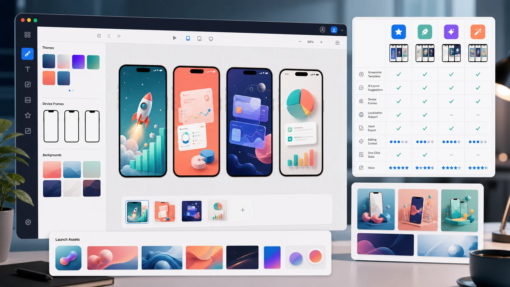
The 7 Best App Store Screenshot Generators in 2026 (Compared)
Compare AppLaunchFlow, AppScreens, Previewed, AppLaunchpad, Shotlingo, Figma, and Canva on AI help, editing control, store sizes, localization, and launch assets.
The 7 Best AI App Icon Generators in 2026 (Honest Comparison)
Compare AppLaunchFlow Icon Composer, Apple Icon Composer, Iconikai, Appicons.ai, Midjourney, Figma, and resize tools on editability, variants, and export quality.
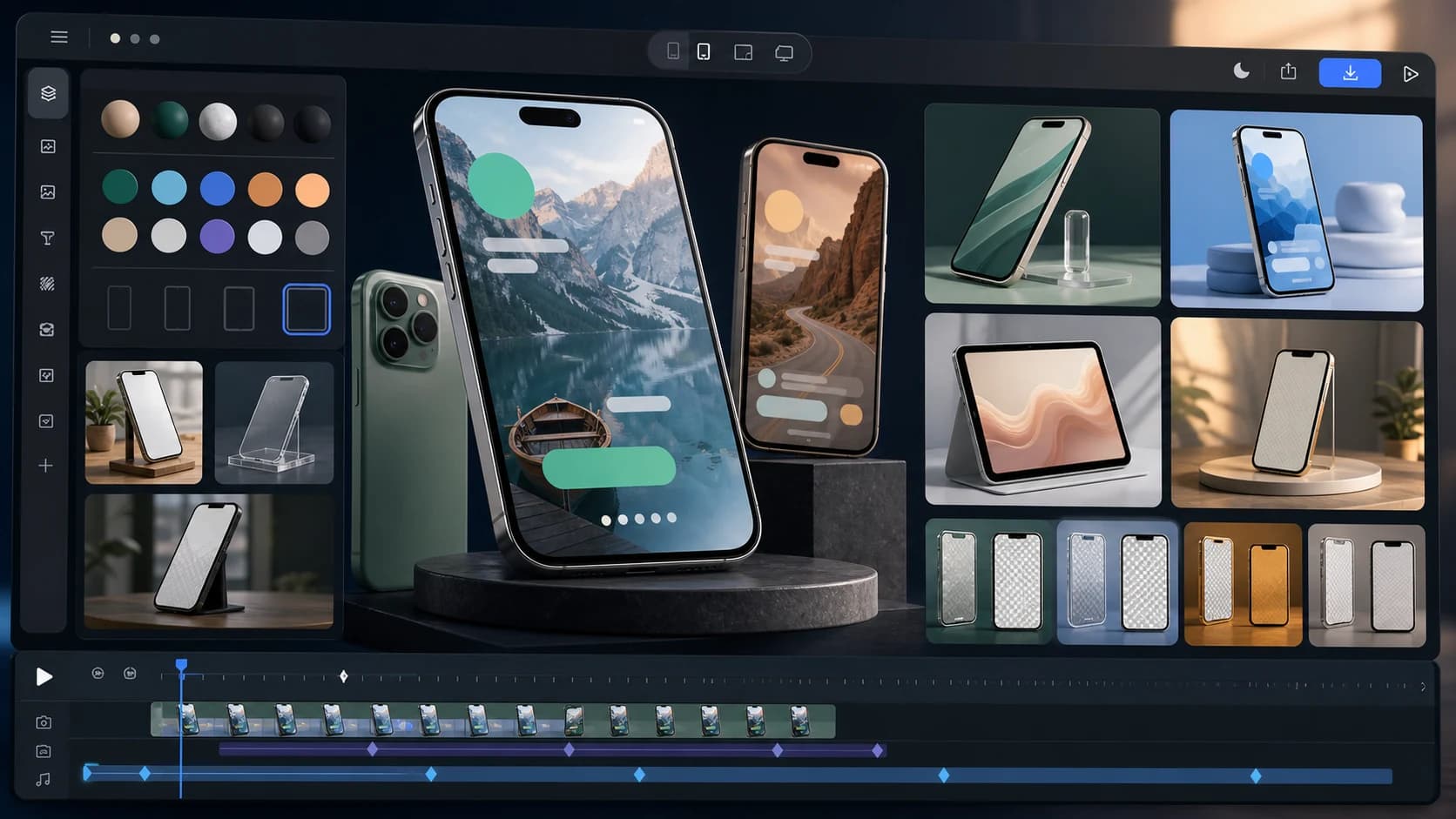
The 7 Best App Mockup Generators for App Launches in 2026
Compare static and animated app mockup tools for launches, including AppLaunchFlow, Rotato, Previewed, Smartmockups, Shots.so, Mockuuups Studio, and Figma.
App Store Screenshot Generator
Create iOS screenshots fast with AI and full editing control.
AI Screenshot Generator
Generate layouts and copy automatically, then refine them your way.
Ready to improve your store page?