Yannick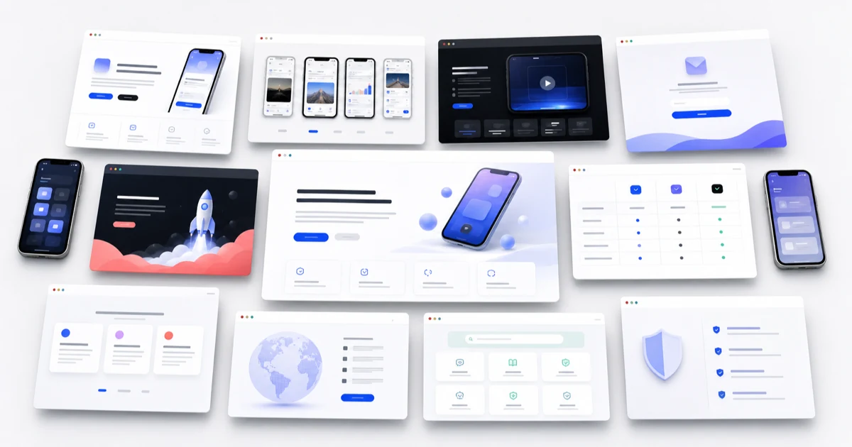
Examples by page job, not decoration
Choose a pattern that matches how visitors discover and evaluate the app
The strongest example is not necessarily the most elaborate one. It is the page whose promise, evidence, and next action match the visitor’s reason for arriving.
Match intent
Start from launch, search, press, paid traffic, support, or pre-order intent.
Show the app
Use real screens and a coherent benefit sequence as the core evidence.
Keep one goal
Make the store click, signup, purchase, or support path unmistakable.
App landing page examples are useful when they reveal a reusable decision pattern, not just a color palette. This guide presents twelve practical page archetypes for mobile apps and explains what each one should emphasize, which store assets can power it, and when the pattern becomes a poor fit. The examples are intentionally product-neutral so teams can apply them without copying another app’s brand or unsupported performance claims.
Quick answer
For most released apps, begin with the product-first pattern: a clear outcome, one real app screen, official store badges, three benefit sections, proof, FAQs, and support links. Choose a waitlist page before release, a campaign page for one audience or promise, a companion-product page when hardware or a service must be explained, or a support-led page when store compliance and customer contact are the immediate need.
The 12 app landing page patterns
Treat these as starting structures rather than templates to copy literally. A page can combine two adjacent patterns, but it should still have one primary conversion goal and one clear audience. If every pattern appears on the same page, the result is usually a generic product site rather than a focused app destination.
| Pattern | Best for | Lead with | Primary action |
|---|---|---|---|
| Product-first | Most released consumer apps | Outcome plus real app screen | Open the store listing |
| Before-and-after | Editing, health, finance, and utility apps | Visible transformation | Try or download |
| Three-step workflow | Apps with a simple repeatable job | Input, action, result | Start the workflow |
| Screenshot story | Visually rich apps | Ordered product screens | Download after the story |
| Demo-led | Motion, AI, camera, and creator tools | Short current product demo | Install or watch details |
| Use-case switcher | Apps serving distinct audiences | Audience-specific outcome | Choose the relevant path |
| Social-proof led | Apps with verifiable adoption | Attributed reviews or outcomes | Join or download |
| Waitlist | Pre-launch products | Problem, promise, expected timing | Join the waitlist |
| Pre-order | Approved upcoming App Store releases | Release promise and preview | Use the official pre-order badge |
| Campaign-specific | Paid, creator, email, or partner traffic | The same promise as the source | Continue to the matched listing |
| Companion product | Apps tied to hardware or a service | The complete system | Buy, activate, or download |
| Support-led | Small apps needing credible public URLs | Publisher identity and help paths | Get help or view policies |
AppLaunchFlow's landing page builder reuses your store screenshots and ASO copy to publish a hosted app landing page in any of these patterns, with the App Store and Google Play badges already wired.
1–3: Product-first, before-and-after, and three-step workflow
The product-first example is the safest default. Place a concrete outcome in the headline, show the relevant screen, and put the store badge beside or below it. Follow with a short benefit sequence. This works when visitors already understand the category and need to decide whether this particular app deserves attention.
A before-and-after page makes the value visible. A photo app can show the source and edited result; a budgeting app can contrast scattered transactions with a categorized view; a focus app can contrast interruptions with a completed session. The example must represent an outcome the app actually produces, with any qualifications close to the claim.
A three-step workflow is useful when perceived effort is the objection. Show a real input, the important app action, and the resulting state. Keep the steps outcome-focused. Installation, account creation, and permission prompts are setup details unless they materially affect the decision.
4–6: Screenshot story, demo-led, and use-case switcher
A screenshot-story page extends the store listing into a longer web narrative. Each screen should advance one benefit and use consistent captions, device treatment, and visual hierarchy. Avoid a gallery of unrelated screens: the order should feel like a guided product tour rather than an asset dump.
A demo-led page is appropriate when motion is the proof—video editing, camera behavior, generative output, animation, or a fast interaction. Keep the opening frame useful, provide a poster image, mute autoplay by default where appropriate, include controls or an accessible alternative, and defer heavy media that is not needed for the first decision.
A use-case switcher helps when one app serves meaningfully different jobs. A finance app might separate household budgeting, freelance expenses, and shared trips. Each path should change the explanation and evidence, not only the tab label. If the same copy works for every audience, one focused narrative is clearer.
7–9: Social proof, waitlist, and pre-order
A proof-led page can lead with a verified rating, attributed customer statement, published outcome, or credible maker story. Use the exact source and keep the scope intact. A rating from one store and country should not be presented as a universal score; a testimonial should link to or identify the person and product when permission allows.
A waitlist page replaces store badges with one concise signup action. Explain what the app will help users do, show enough product evidence to make the promise credible, state what subscribers will receive, and avoid implying that unfinished features are already available. Keep the form short and make consent language appropriate to the email workflow.
Apple provides a localized pre-order badge for apps configured for pre-order and instructs developers to replace it with the download badge after release. A pre-order page should therefore have an operational update plan: release date or window, current preview, supported devices, and a scheduled badge and copy change when the app becomes downloadable.
10–12: Campaign-specific, companion-product, and support-led
A campaign-specific page continues one promise from an ad, creator post, email, QR code, or partnership. Preserve the same audience, terminology, visual cue, and destination. If the campaign promotes collaborative planning, the page and first store screenshots should not revert to a generic personal productivity story.
A companion-product page explains the whole system when the app depends on hardware, a membership, or another service. Lead with the combined outcome, show how the app participates, and make purchase, activation, compatibility, and store-download actions distinct. Sending every visitor directly to the store can omit information needed for the decision.
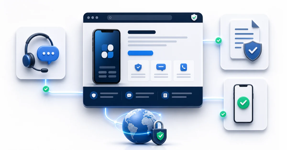
A support-led page is deliberately simple: app identity, publisher identity, current support contact, common help paths, Privacy, Terms, and the store listing. Apple requires a Support URL for platform versions and says the destination must lead to actual contact information. The page can still include a short product explanation, but help and compliance links must not be decorative or hidden.
Match the pattern to the acquisition source
Search visitors may need a fuller explanation because they have not seen the campaign context. Paid and creator traffic expects message continuity. Press and Product Hunt visitors often want a quick product tour, maker identity, and store path. Existing users arriving from a store support link need contact and policy information immediately. The same design cannot prioritize every journey equally.
Create a small intent map before adding page variants. List each meaningful source, the promise already made there, the visitor’s likely question, the evidence that answers it, and the desired next action. Merge sources that share the same path. Publish a separate page only when it provides a genuinely different and useful answer.
What every example still needs
Regardless of pattern, the page must remain accurate, usable, and maintainable. Apple says App Store badges should use official artwork, remain subordinate to the main message, and not be modified or animated. Google recommends mobile-friendly pages and good Core Web Vitals. Support and privacy destinations need to stay public and current for as long as the app depends on them.
- A clear app name, publisher identity, outcome, and current product visual.
- One primary action with official, localized badge artwork where applicable.
- A responsive layout with essential content available on mobile.
- Fast, dimensioned media that avoids layout shifts and unnecessary downloads.
- Attributed proof and supportable claims.
- Working support, privacy, terms, and contact links.
- Analytics that distinguish page visits from store, waitlist, and support actions.
Continue the workflow
Primary sources and verification notes
Platform requirements and software capabilities change. These sources were reviewed for this guide on August 22, 2026; open the current source again before publishing assets, enabling production access, or standardizing a team workflow.
- Apple: Marketing Resources and Identity Guidelines: Official rules for download and pre-order badges, localization, placement, and modification.
- Apple: Platform version information: Official Support URL and Marketing URL definitions for App Store versions.
- Google Search Central: Core Web Vitals: Current field-performance thresholds for loading, interactivity, and visual stability.
- Google Search Central: SEO fundamentals: Official mobile crawler, HTTPS, page experience, and search appearance guidance.
- Unbounce: Mobile app landing page examples: Secondary source used to verify examples-oriented search intent and common conversion goals.
App Landing Page Examples FAQ
What is the best landing page pattern for a mobile app?
For most released apps, use a product-first page with one outcome, one real app screen, official store badges, three to five benefits, proof, FAQs, and support links. Choose another pattern only when the visitor intent or product model materially differs.
Can an app landing page have more than one call to action?
It can have secondary actions, but one action should be visually and analytically primary. Common secondary actions include watching a demo, reading support information, or choosing the other app store.
Should I create separate pages for ad campaigns?
Create a separate campaign page when it continues a distinct audience promise, use case, or store destination. Do not create near-duplicate pages that only swap a headline; each page should provide materially useful and differentiated content.
What proof can a new app use without reviews?
Use current product screens, a transparent maker identity, a specific workflow demonstration, beta feedback with permission, security or privacy facts you can verify, and clear support information. Never invent ratings, customers, press logos, or download counts.