Yannick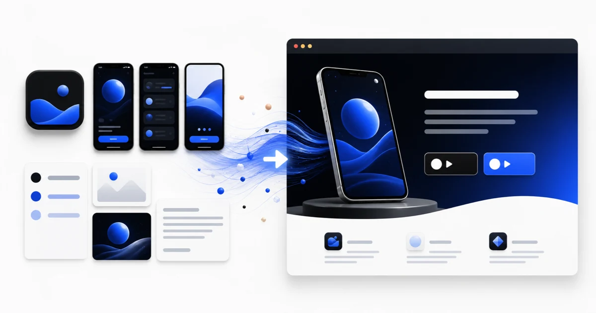
From store assets to a focused page
Build around one promise, one product story, and one next action
A useful app landing page is not a second store listing. It gives search, campaign, press, and referral visitors enough context to choose the right store or next step.
Define
Choose the audience, visit source, primary promise, and conversion action.
Assemble
Reuse app screenshots, benefits, proof, store links, and support information.
Verify
Test mobile layout, performance, metadata, links, and measurement before launch.
A mobile app landing page gives an app a public destination outside the App Store and Google Play. It can explain the product to people arriving from search, launch posts, press coverage, creator links, email, or paid campaigns, while still directing high-intent visitors to the appropriate store. This guide turns current Apple marketing rules, Google Search guidance, and store-link requirements into a practical build sequence.
Quick answer
Start with a benefit-led hero, one primary action, an authentic app screen, and the correct App Store or Google Play badge. Follow with three to five benefit sections, a short product walkthrough, credible proof, FAQs, and visible support and privacy links. Build mobile-first, keep the page fast, and reuse the same benefit order and screenshots as the store listing so the transition from page to store feels coherent.
Choose the page job before choosing the layout
The page needs one primary job. A released consumer app usually wants a store-badge click. A pre-launch app may want a waitlist signup. A paid app may need to explain pricing before sending the visitor to the store. A companion app may need to explain the physical product first. Mixing all four goals above the fold produces competing calls to action and makes measurement ambiguous.
Write a one-line brief before designing: audience, source, problem, promised outcome, proof, and next action. For example: ‘People arriving from a productivity newsletter should understand how the app protects focus, see the timer in use, and open the iOS listing.’ That sentence determines the headline, first screenshot, CTA, and which objections deserve space.
- Primary audience and acquisition source are explicit.
- The headline names an outcome rather than a vague product category.
- One action is primary; secondary actions are visually subordinate.
- The first product visual proves the promise instead of decorating it.
A 10-section app landing page template
Not every page needs all ten sections, but this sequence covers the common questions between first impression and store click. Remove a section when you do not have credible material for it; do not fill gaps with invented ratings, customer logos, or download counts.
| Section | Question it answers | Recommended input | Common mistake |
|---|---|---|---|
| Hero | What does the app help me do? | Benefit headline, app screen, primary CTA | Leading with a feature list |
| Trust strip | Is this real and credible? | Verified rating, press, customers, or maker identity | Using unsupported numbers |
| Benefits | Why should I care? | Three to five outcomes tied to screens | Repeating navigation labels |
| Product story | What will I actually experience? | Ordered screenshots or a short demo | Showing unrelated screens |
| How it works | How much effort is required? | Three concrete steps | Explaining implementation details |
| Use cases | Is this for someone like me? | Audience or job-specific examples | Targeting everybody |
| Proof | Why should I believe the promise? | Attributed reviews, outcomes, or case evidence | Anonymous praise |
| FAQ | What might stop me? | Pricing, platform, privacy, account, and compatibility answers | Restating marketing copy |
| Final CTA | What should I do now? | Correct store badge or signup action | Introducing a new offer |
| Footer | How do I get help and verify the publisher? | Support, privacy, terms, company, and contact links | Hiding required URLs |
Reuse the store story instead of rebuilding the message
Your store listing already contains a prioritized product story: icon, name, subtitle or short description, screenshots, preview video, description, ratings, and reviews. Reuse the strongest parts, but adapt them to a web page. A store screenshot caption can become a benefit heading; the screenshot itself can become the proof directly beneath it; an App Preview scene can become a short hero or walkthrough clip.
Keep the benefit order consistent between the landing page and store listing. If the page leads with private habit tracking but the first store screenshot leads with social challenges, the visitor has to reconcile two different promises. Consistency does not require identical layouts. It means the same audience, outcome, terminology, and product evidence survive the handoff.
Use official store badges as the conversion action
Apple’s marketing guidelines say to use the provided App Store badge, keep it subordinate to the main message, avoid modifying or animating it, and use localized badge artwork rather than translating the badge yourself. Apple also provides marketing tools that generate links, badges, app icons, and QR codes for the product page.
Google Play publishes its own badge guidelines and localized artwork. Use the correct destination for the visitor’s platform and country, and test every link on a real phone. If the app is available on both stores, keep the choices together and visually balanced. If it is available on one platform only, do not show a disabled badge for the other platform.
Design mobile-first and protect page speed
A large share of app-page visitors will arrive on the device that can install the app. The mobile layout therefore needs to work as the primary experience, not as a compressed desktop afterthought. Keep the benefit and action visible early, use readable type, avoid horizontal screenshot carousels that hide essential context, and make tap targets comfortable around store badges and navigation.
Google recommends good Core Web Vitals for both search and user experience. Its current guidance defines good thresholds as Largest Contentful Paint within 2.5 seconds, Interaction to Next Paint under 200 milliseconds, and Cumulative Layout Shift below 0.1. Treat those as field-performance goals, not guarantees from one laboratory run. Compress hero media, reserve image dimensions, defer non-critical video, and measure real traffic after publication.
Give search engines a clear, indexable app page
Use one descriptive title and one visible H1 that explain the app’s job in natural language. Write a concise meta description, use descriptive headings, provide useful alt text for product screens, and link the page from relevant parts of your site. Keep the canonical URL stable and include the page in the sitemap. Google uses a mobile crawler by default, so essential copy and links must remain available in the mobile rendering.
Do not turn the page into a list of repeated keywords. A focused page can target the app name, category, core problem, and primary use case through useful explanations and examples. If the app serves several materially different intents, publish supporting pages only when each one has distinct content and a legitimate user journey back to the main app page or store listing.
Pre-publish checklist
Review the page as a visitor, publisher, support contact, and search crawler. Then click every store, privacy, terms, support, social, and email link from both desktop and mobile. Verify that the live page represents the current app version and that every claim can be substantiated.
- One primary conversion action and a benefit-led hero.
- Current screenshots that match the released or promoted version.
- Official, localized store badges linked to the correct listings.
- Real proof with attribution and permission where required.
- Public support, privacy, terms, and contact destinations.
- Unique title, description, H1, canonical URL, and sitemap entry.
- Mobile layout, keyboard navigation, alt text, and contrast checked.
- Core Web Vitals, analytics events, and campaign parameters verified after launch.
Continue the workflow
Primary sources and verification notes
Platform requirements and software capabilities change. These sources were reviewed for this guide on August 22, 2026; open the current source again before publishing assets, enabling production access, or standardizing a team workflow.
- Apple: Marketing Resources and Identity Guidelines: Official App Store badge, localization, placement, and linking rules.
- Google Play: Brand guidelines: Official Google Play badge artwork and usage guidance.
- Google Search Central: Core Web Vitals: Current loading, responsiveness, and visual-stability thresholds.
- Google Search Central: SEO fundamentals: Official mobile crawling, page experience, HTTPS, and search appearance guidance.
- Apple: Platform version information: Official definitions for Support URL, Marketing URL, screenshots, and version metadata.
Create an App Landing Page FAQ
What should a mobile app landing page include?
At minimum, include a benefit-led hero, an authentic app screen, a primary store or signup action, key benefits, product proof, support and privacy links, and a clear publisher identity. Add walkthroughs, reviews, pricing, and FAQs only when they help the visitor decide.
Should an app landing page copy the App Store listing?
It should preserve the same audience, promise, terminology, and screenshot story, but adapt them to the web. The page can provide more context, searchable explanations, support information, and campaign-specific paths than a store listing.
Do I need separate landing pages for iOS and Android?
Usually one responsive page with both official badges is enough. Separate pages make sense when platform features, pricing, availability, or acquisition campaigns are materially different and each page offers distinct useful content.
How fast should an app landing page load?
Google’s good Core Web Vitals targets are LCP within 2.5 seconds, INP under 200 milliseconds, and CLS below 0.1. Measure real-user data after launch and optimize large hero media, scripts, and layout shifts first.