Yannick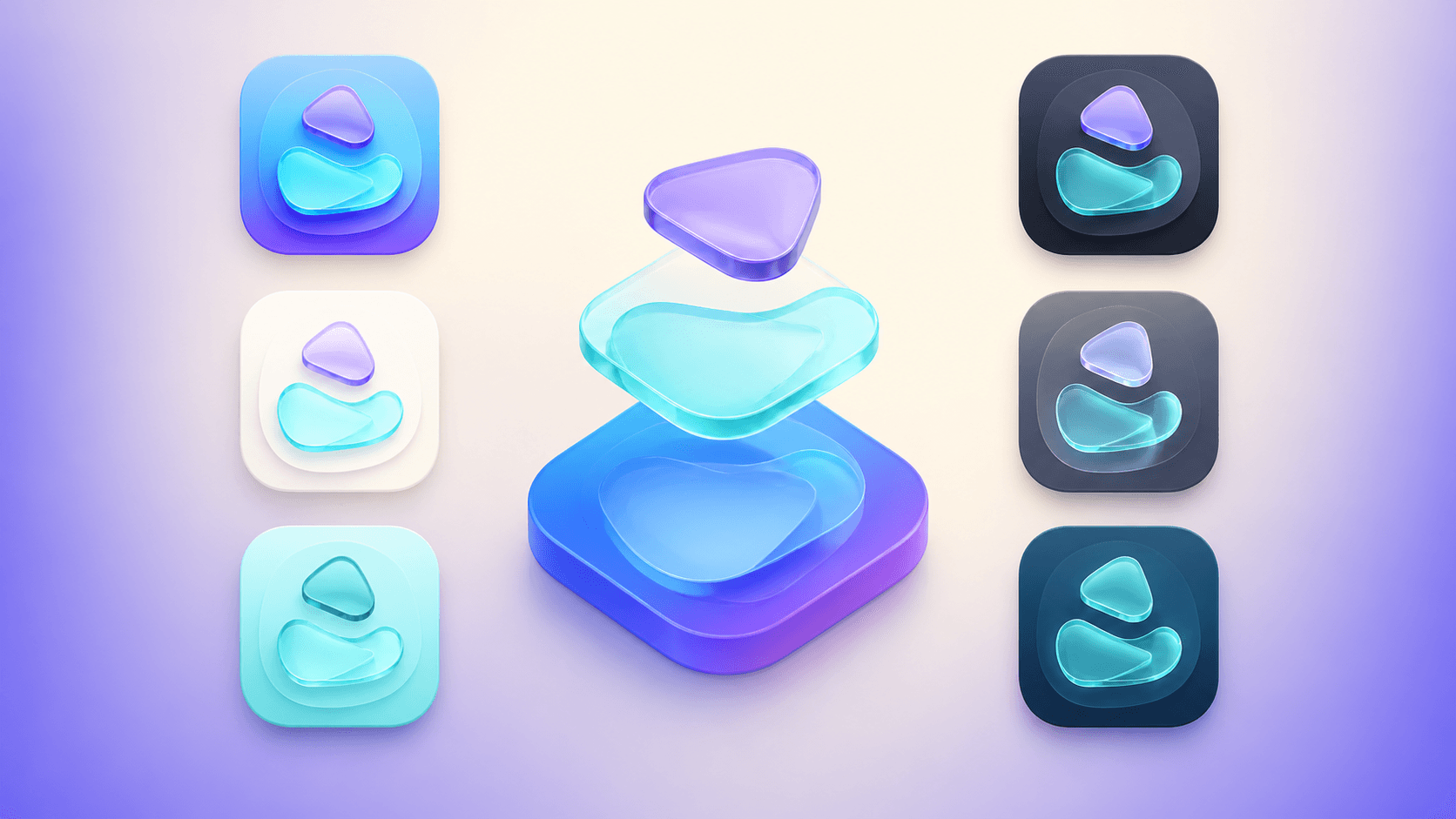
Design one identity across many appearances
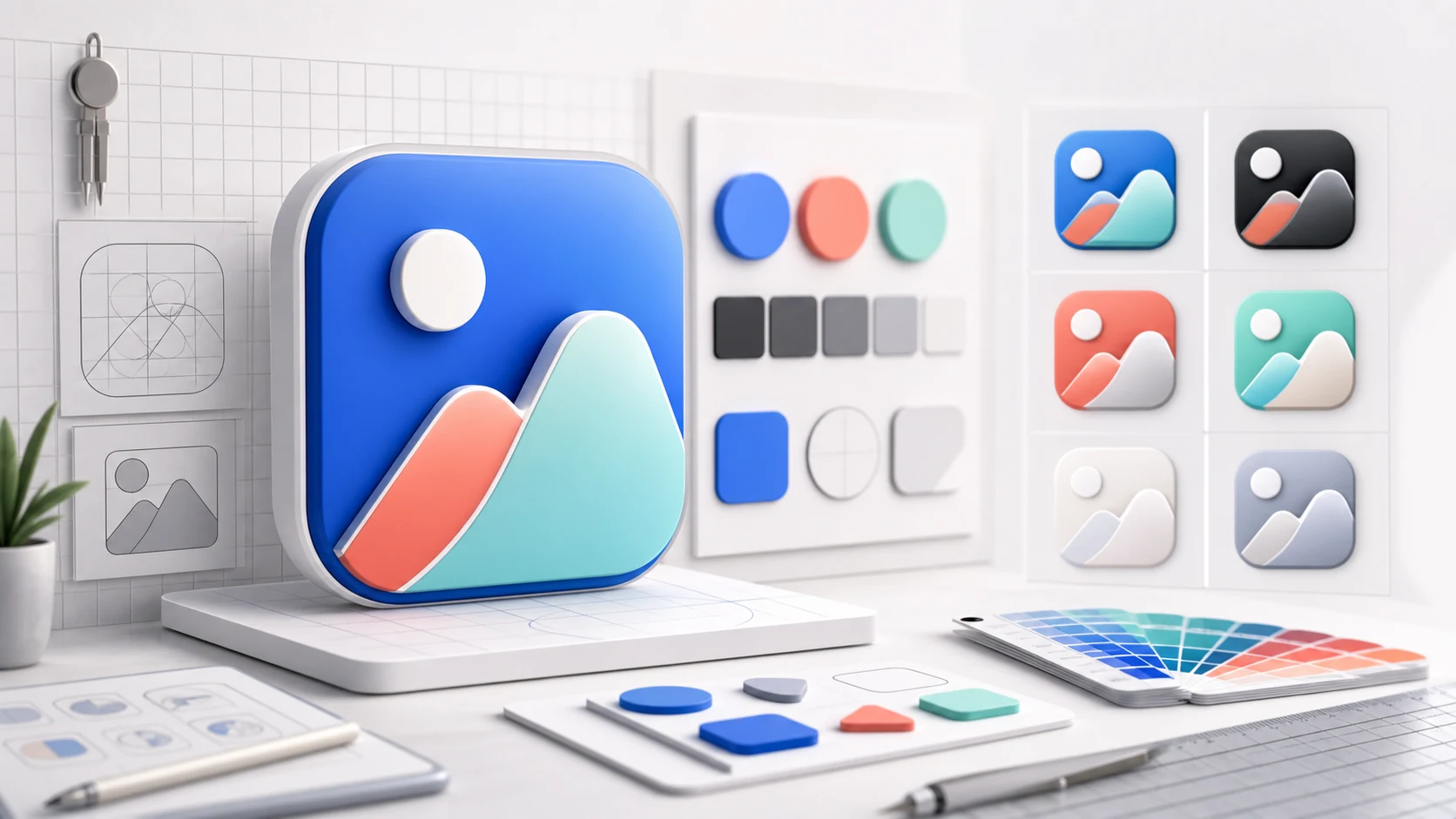
A 1024×1024 canvas is the beginning, not the whole icon system
Current Apple icons can be layered and appear as default, dark, clear, and tinted variants. Recognition must survive effects, scaling, masking, and personalization.
Structure
Build a 1024×1024 layered master with a stable silhouette and clear foreground hierarchy.
Adapt
Provide deliberate default, dark, clear, and tinted appearances where automatic results are insufficient.
Verify
Preview at real sizes, across system versions and wallpapers, then validate the Xcode asset before archive.
Apple's current app-icon guidance reflects the Liquid Glass system introduced across recent platform releases and refined in June 2026. For iOS, iPadOS, and macOS, Apple documents a 1024×1024 square layout, a system-applied rounded-rectangle mask, layered artwork, and default, dark, clear-light, clear-dark, tinted-light, and tinted-dark appearances. The system can generate variants you omit, but intentional testing remains the designer's responsibility.
Quick answer
Create a 1024×1024 layered master for iOS, iPadOS, and macOS. Keep essential artwork away from the outer edge, do not bake a rounded-rectangle mask into the source, and preserve the same recognizable symbol across default, dark, clear, and tinted appearances. Use Icon Composer to arrange layers, preview Liquid Glass effects and appearance variants, then export for Xcode. Check the icon at Home Screen, Spotlight, Settings, and notification sizes before shipping.
The current Apple icon specification
Apple's Human Interface Guidelines list a 1024×1024-pixel square layout for iOS, iPadOS, and macOS app icons. The operating system applies the rounded-rectangle shape, scales the master for smaller contexts, and renders layered artwork with system effects. The source should therefore be a complete square composition, not a PNG with manually rounded corners or transparent gaps designed to imitate the final mask.
The same guidance lists six appearance outcomes: default, dark, clear light, clear dark, tinted light, and tinted dark. Designers can provide variants, while the system automatically generates appearances that are missing. Automatic generation is a fallback, not proof that contrast, depth, and brand recognition remain acceptable on every wallpaper and personalization setting.
| Platform | Layout size | System shape | Style | Appearance model |
|---|---|---|---|---|
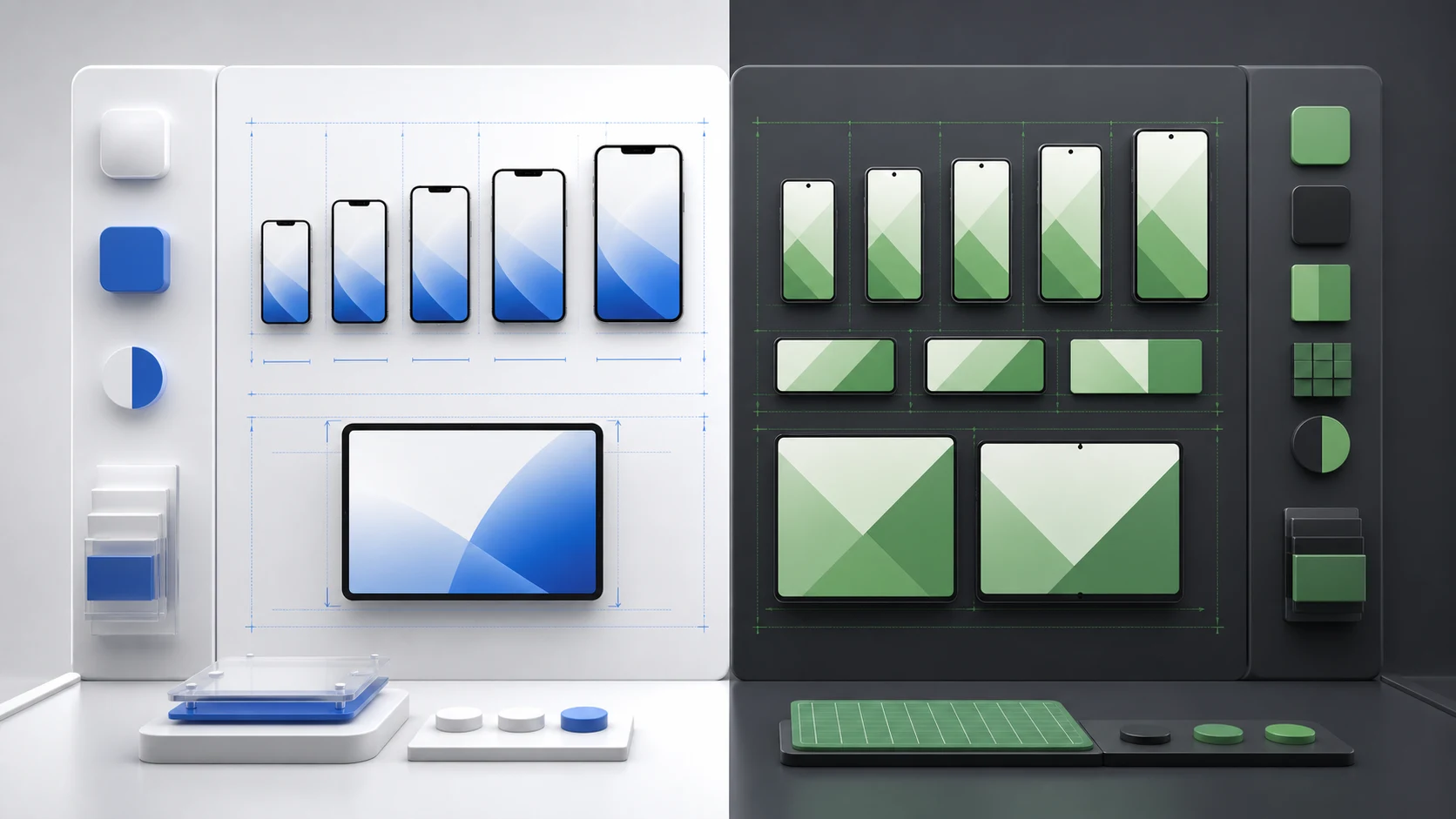
| iOS, iPadOS, macOS | 1024×1024 | Rounded rectangle | Layered | Default, dark, clear, tinted |
| tvOS | 800×480 | Rounded rectangle | 2–5 layer parallax | Platform-specific |
| visionOS | 1024×1024 | Circular | Layered 3D | Platform-specific |
| watchOS | 1088×1088 | Circular | Layered | Platform-specific |
What layered artwork changes
A layered icon separates the background from one or more foreground elements. Apple applies adaptive effects such as highlights, refraction, translucency, and depth. The result can vary with icon size, system version, environment, and interaction. Design the layers as a composition that remains complete before and after effects, rather than relying on a single decorative reflection to create the brand mark.
Use the background layer to provide the full visual field and contrast. Foreground layers should contain the recognizable symbol and supporting depth elements. Avoid thin outlines, tiny counters, or edge details whose meaning disappears after scaling. Excessive layer depth can make an icon feel like several unrelated stickers; use separation only where it explains form or improves legibility.
- Keep the core symbol identifiable in silhouette.
- Use layers to express meaningful depth, not to multiply effects.
- Check foreground placement after the system mask and motion are applied.
- Avoid transparency that creates accidental holes or weak edge contrast.
Default and dark appearances
The default icon carries the primary brand palette. The dark appearance should feel related rather than inverted mechanically. Apple advises using the light icon as the basis for the dark icon, choosing complementary colors, avoiding excessively bright imagery, and remembering that color backgrounds often provide better contrast in dark contexts.
Preserve the core features across appearances. Swapping the main object, changing the silhouette, or introducing a different metaphor can make the app harder to find when the user changes appearance. A dark variant may adjust luminance, background, highlights, and material treatment while the symbol and overall visual identity remain stable.
Clear and tinted appearances
Clear and tinted appearances are more dependent on system rendering and user-selected context. Apple notes that these outcomes can be more subdued than the default or dark icon. A brand that depends on several close colors, photographic texture, or a subtle gradient may lose its hierarchy, so the symbol must still work through shape, spacing, and value contrast.
Test clear-light and clear-dark separately. For tinted appearances, inspect several tint colors rather than optimizing around one attractive screenshot. If the system-generated variant muddies the mark, provide an intentional monochrome treatment through Icon Composer while maintaining the same visual features. Do not add detail merely to compensate for one preview; simplify the underlying mark first.
Build and export with Icon Composer
Apple's guidance positions Icon Composer as the tool for defining the background, arranging foreground layers, applying and previewing effects, annotating default, dark, and mono appearance variants, testing across system versions, and exporting an icon for Xcode. Keep the editable Icon Composer project in version control or a durable design archive alongside the exported asset.
Export only after reviewing the composition at multiple display sizes. In Xcode, add the generated icon to the app target's asset configuration and confirm the build uses the intended resource. Archive a release candidate and inspect the installed app, not only the design preview. Build settings, target membership, or a stale catalog can produce a technically valid archive with the wrong icon.
Small-size legibility and optical spacing
The 1024-pixel canvas invites detail that will never survive at notification or Settings size. Review the icon at 16, 20, 29, 40, 60, and 76-point-like contexts on representative devices, even though the system generates the actual files. Blur your vision or zoom out to test whether the category and silhouette remain understandable before evaluating texture.
Optical centering may differ from geometric centering. A triangular play shape, angled rocket, or asymmetric letter can appear off-center even when its bounding box is mathematically centered. Adjust the visual mass in the master, then recheck every appearance because highlights and dark backgrounds change perceived balance.
Alternate icons require the same discipline
Apple supports alternate app icons for iOS and iPadOS, but the variants remain subject to App Review and must relate closely to the app's content and experience. Apple's current guidance says alternate icons also require their own dark, clear, and tinted variants. A seasonal set therefore multiplies production and QA rather than adding one decorative file.
Use alternate icons for meaningful personalization, such as a supported team, theme, or achievement, and provide an in-app selection experience that accurately previews the result. Keep the main brand relationship obvious and maintain a manifest of alternate names, appearance assets, product availability, and release tests.
Pre-submission icon QA
Install a release build on current iPhone and iPad versions, switch through supported appearance settings, search in Spotlight, open Settings and notifications, and compare the icon beside both system apps and category competitors. Verify the asset contains no unauthorized third-party marks, screenshots, standard system-interface replicas, or text that becomes unreadable.
Finally, compare the product-page icon, installed Home Screen icon, marketing screenshots, and website favicon. They can use platform-appropriate rendering, but users should recognize one product. When a new Liquid Glass or Xcode release changes the rendering, revisit the source rather than flattening effects into a workaround that will age poorly.
- 1024×1024 square source with no baked rounded-corner mask.
- Stable symbol across default, dark, clear, and tinted appearances.
- Legible at Home Screen, search, Settings, and notification sizes.
- Correct asset selected by the release target and visible in an installed build.
- Alternate icons include and validate their own appearance variants.
Continue the workflow
Primary sources and verification notes
Platform requirements and software capabilities change. These sources were reviewed for this guide on August 16, 2026; open the current source again before publishing assets, enabling production access, or standardizing a team workflow.
- Apple HIG: App icons: Current sizes, layers, appearances, platform guidance, and June 2026 refinement.
- Apple Developer: Configuring your app icon: Xcode asset configuration and current appearance workflow.
- Apple Developer: Icon Composer: Apple's tool for layered icon composition, preview, and export.
- Apple App Review Guidelines: Review requirements that apply to default and alternate icons.
iOS 26 App Icon Sizes and Variants FAQ
What size should an iOS 26 app icon be?
Apple documents a 1024×1024-pixel square layout for iOS, iPadOS, and macOS. The system applies the rounded-rectangle mask and generates smaller presentation sizes.
Do I need dark and tinted icon variants?
The system can generate appearances you do not provide, but you should preview default, dark, clear, and tinted results. Provide deliberate variants when automatic rendering weakens contrast or recognition.
Should an iOS app icon include rounded corners?
No. Supply a complete square composition and let the operating system apply its mask. Baked corners or transparent edge gaps can produce incorrect results.
Do alternate app icons need appearance variants?
Yes. Apple's current guidance says alternate icons on iOS and iPadOS require their own dark, clear, and tinted variants and remain subject to App Review.