Yannick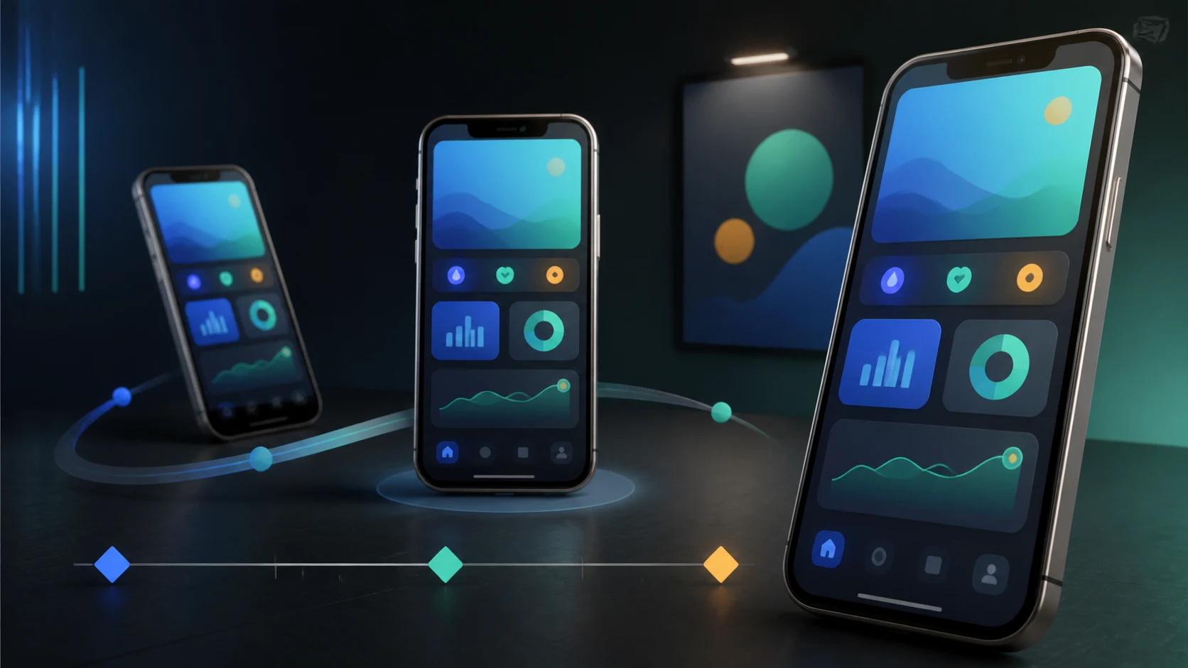
Show the app, not an empty device
Build motion around one real product moment
An effective animated mockup keeps the interface readable, gives the device one clear movement, and exports a channel-specific composition instead of a generic spin.
Choose
Pick one screen, one audience, one product proof, and the destination format.
Animate
Use restrained camera and device motion that supports the interface hierarchy.
Export
Create native vertical, square, and landscape cuts and verify store-specific rules.
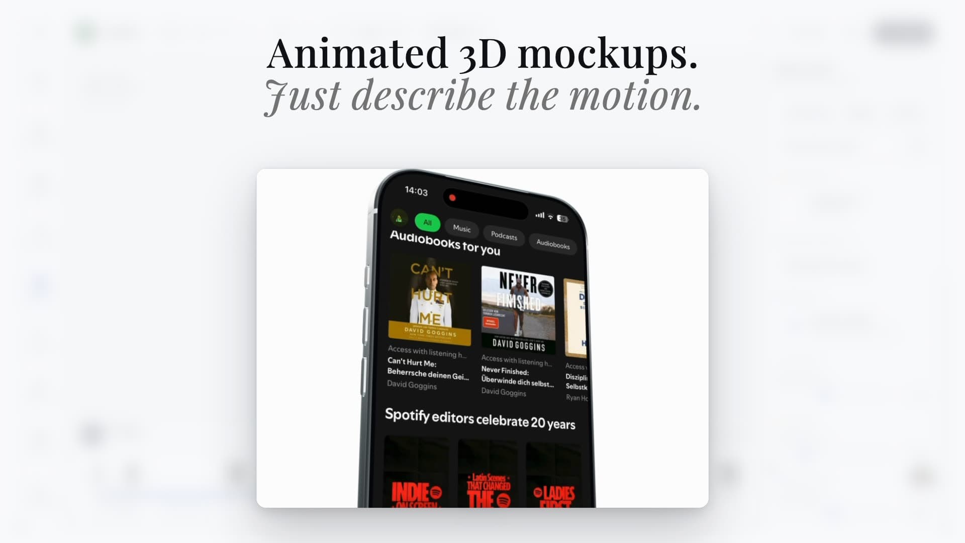
An animated device mockup places a real app screen or screen recording inside a moving phone, tablet, laptop, or watch frame. It is useful for landing pages, launch posts, paid social, presentations, and product videos because it gives flat UI a physical point of view. The device is not the story, though: motion should help a viewer notice what the app does, not turn a readable interface into a decorative 3D object.
Quick answer
Start with a clean screenshot or short screen recording, choose the correct device and orientation, then use one primary movement such as a slow push-in, tilt, slide, or two-device reveal. Keep the product screen large enough to read, protect safe zones, and export separate 9:16, 1:1, and 16:9 compositions. Use animated mockups freely on launch pages and marketing channels, but do not assume a cinematic device render is valid as an Apple App Preview: Apple requires previews to use video screen captures of the app itself, with only explanatory overlays and straightforward transitions.
Choose the destination before choosing the animation
A landing-page hero, Instagram Reel, pitch deck, and App Store preview solve different jobs. A landing page can loop a quiet six-second product reveal. A vertical social cut needs a faster opening and room for interface controls. A presentation may need transparency or a clean background. Store assets have platform rules that are stricter than general marketing video.
Write a small brief before opening the editor: destination, aspect ratio, audience, product moment, proof, duration, and next action. That decision keeps the motion preset from becoming the concept. If the product moment is `scan a receipt and see the expense categorized`, the animation should reveal that sequence, not merely rotate an unreadable dashboard.
| Destination | Starting ratio | Useful duration | Primary job | Watch for |
|---|---|---|---|---|
| Landing-page hero | 16:9 or responsive crop | 4–10 seconds | Prove the headline | Autoplay, load weight, loop seam |
| Reels / TikTok / Shorts | 9:16 | 6–20 seconds | Stop and demonstrate | UI overlays and muted viewing |
| Feed post / carousel | 1:1 or 4:5 | 4–12 seconds | Show one feature | Small interface text |
| Presentation / launch deck | 16:9 | 5–15 seconds | Explain a workflow | Playback reliability and contrast |
| Google Play promo video | YouTube landscape | Channel-specific | Show app value | Play preview-asset rules |
| Apple App Preview | Device-specific | 15–30 seconds | Show the real app | Screen-capture-only requirement |
Prepare screenshots and recordings that survive motion
Use current, high-resolution UI with no personal data, debug overlays, placeholder copy, or inconsistent status bars. Match the source orientation to the device frame. A portrait screenshot stretched into a landscape device will look wrong even when the frame itself is polished. If the animation uses a screen recording, trim dead time before importing it and keep taps or gestures understandable without relying on narration.
Choose the screen for visible evidence. Dense analytics dashboards often become illegible after perspective and motion; a focused task or result can survive a smaller size. If the UI needs explanation, shorten the caption and slow the motion instead of stacking several labels around the device.
- Capture the released or promoted app version.
- Remove personal data, notifications, cursor noise, and accidental overlays.
- Use the correct device family and orientation.
- Check contrast at the final playback size, not only in the editor.
- Keep a clean screenshot fallback for reduced-motion and slow connections.
Use one primary motion and one supporting motion
A strong first version needs less choreography than most template galleries suggest. Use one primary device or camera movement to establish attention, then one supporting movement to reveal the product state. For example: a phone slides into the center, pauses while the interface changes, then moves slightly closer to the completed result.
Avoid constant rotation, fast parallax, and deep perspective when the viewer needs to read the screen. Easing should make the device feel physical, but the interface should remain the visual anchor. Jitter's own device library includes sliding, rotating, cascading, and gallery patterns; Rotato focuses on prepared 3D devices, virtual camera control, and animation. Those are different levels of control, not evidence that every mockup needs every effect.
| Pattern | Best for | Structure | Failure mode |
|---|---|---|---|
| Slow push-in | One key result | Wide start → readable pause → closer proof | Zooming beyond legibility |
| Slide and settle | Feature introduction | Enter → ease → hold | Never allowing the screen to rest |
| Two-device handoff | Before and after | State A → overlap → state B | Competing focal points |
| Fan or cascade | Multiple screens | Ordered reveal → grouped hold | Showing too many tiny screens |
| Tilt with screen change | Physical polish | Small angle → UI transition → return | Using a dramatic spin as the story |
Design text, safe zones, and backgrounds for the final crop
Treat text as a separate composition layer rather than baking it into the screenshot. Keep the promise short, use large type, and reserve a stable region that will not collide with the moving device. A background should separate the device silhouette and support the brand without creating a second focal point.
Recompose each aspect ratio. A 16:9 scene can place copy beside the device, while 9:16 usually needs a vertical hierarchy. Cropping the landscape master into a vertical frame can remove the phone, clip the headline, or place both under platform controls. Keep editable layers for background, device, screen, headline, caption, logo, and CTA so localization and later format changes do not require rebuilding the animation.
- Keep critical text away from corners and bottom interface areas.
- Preview every frame at actual phone size.
- Let translated text reflow; do not shrink every locale to fit the English box.
- Use a static poster frame that communicates the feature before playback begins.
- Provide a reduced-motion or static alternative on the web.
Understand the App Store and Google Play boundary
Animated device mockups are excellent marketing assets, but App Store previews are not unrestricted marketing videos. Apple's App Review Guideline 2.3.4 says previews may only use video screen captures of the app itself. Apple allows narration and video or text overlays for explanation, recommends straightforward transitions, and requires App Previews to be 15–30 seconds with device-specific technical specifications. A floating 3D phone can be useful on your website or social feed without automatically being acceptable as the preview submitted to App Store Connect.
Google Play accepts preview assets and a preview video through the store listing. Its official guidance explains that these assets may appear beyond the listing and must comply with store policies. For the normal promo-video field, verify the current YouTube, monetization, embed, content, and localization requirements in Play Console before publishing.
Keep two deliverables when needed: a cinematic animated mockup for marketing channels and a store-compliant cut built from truthful in-app footage. They can share captions, colors, feature order, and source recordings without being the same export.
An AppLaunchFlow workflow without After Effects
In AppLaunchFlow, start from the screenshots already stored in the app project, choose a 3D mockup template and device, then create two variations of the same template before selecting the stronger result. Adjust the device angle, choreography, background, timing, and format while keeping the product screen connected to the rest of the launch assets.
Export the native destination ratios rather than a single universal movie. Reuse the chosen visual system in screenshots, promo video scenes, social launch graphics, mobile ads, and the app landing page. That consistency is the main advantage of keeping animated mockups inside the same launch workspace instead of treating them as a detached motion-design project.
- Select one screen or a short ordered screen sequence.
- Generate or choose two motion variations for the same template.
- Pick the version that keeps the product proof readable.
- Adjust angle, timing, background, and caption hierarchy.
- Export separate vertical, square, and landscape compositions.
- Check the destination's current policy before using a marketing cut in a store listing.
Preflight checklist
Watch the export once for visual polish and once for truth. The second pass asks whether the animation implies gestures, speed, results, devices, or features the real app does not provide. Then test the asset on the actual page or platform, because compression, autoplay, browser playback, and interface overlays can change the result after export.
- Current app UI and correct device frame.
- One visible feature and a readable completed state.
- No personal data, unsupported claims, or licensed content without permission.
- Native composition for each ratio; no accidental crop.
- Legible captions with sound off and motion paused.
- Clean poster frame, loop, and reduced-motion fallback where relevant.
- App Store or Google Play policy checked for store-bound exports.
Continue the workflow
Primary sources and verification notes
Platform requirements and software capabilities change. These sources were reviewed for this guide on August 30, 2026; open the current source again before publishing assets, enabling production access, or standardizing a team workflow.
- Apple: App Review Guidelines: Guidelines 2.3.3 and 2.3.4 for truthful screenshots and screen-capture-based previews.
- Apple: Show more with app previews: Official story, capture, transition, text, sound, and in-app-content guidance.
- Apple: App preview specifications: Current duration, format, frame-rate, file-size, and device-resolution requirements.
- Google Play: Add preview assets: Official preview-asset usage, content, and store-listing guidance.
- Jitter: Animated device mockups: First-party description of its device templates, movements, customization, and use cases.
- Rotato: 3D mockup generator and animator: First-party description of prepared 3D devices, camera controls, animation, and exports.
Animated Device Mockups FAQ
What is an animated device mockup?
It is a screenshot or screen recording placed inside a moving phone, tablet, watch, or laptop frame. The device and camera motion provide context while the real product interface remains the subject.
How do I animate a phone mockup without After Effects?
Use a specialized mockup animator: upload a screenshot or recording, choose a prepared device and motion template, adjust angle, timing, background, and copy, then export native vertical, square, or landscape formats.
Can I use an animated 3D phone mockup as an App Store preview?
Do not assume so. Apple says App Previews may only use video screen captures of the app itself, with explanatory overlays and straightforward transitions. Keep cinematic device mockups for marketing unless the store-bound edit clearly follows current Apple rules.
What is the best aspect ratio for an animated app mockup?
It depends on the destination. Use 9:16 for vertical social video, 1:1 or 4:5 for feeds, and 16:9 for presentations, YouTube, and many landing-page sections. Recompose rather than mechanically crop.
Should an animated mockup use a screenshot or screen recording?
Use a screenshot when one state proves the feature and a recording when the interaction itself is the proof. In both cases, keep the UI current, readable, and free of personal data or misleading behavior.