App Icon Design Tips: Create App Store & Play Store Icons That Stand Out
Master the art of app icon design with these essential tips for creating memorable, recognizable icons.
Let's be honest: designing an app icon that actually stands out is way harder than it looks. You've got this tiny little square competing against millions of other apps, and users spend maybe half a second looking at it before deciding whether to tap or scroll past.
I've seen so many indie developers obsess over their app's features while throwing together a quick icon in Canva the night before launch. Big mistake. Your icon is often the first (and sometimes only) impression you get to make. Here's what actually works, based on what I've learned from analyzing hundreds of top-performing apps.
Simplicity Wins Every Time
The best app icons are almost stupidly simple. Think about the apps you use every day: Instagram (a camera), Spotify (sound waves), Twitter/X (a bird). These icons work because your brain can process them instantly.
Here's a test I use: shrink your icon down to 29x29 pixels (the smallest size it'll appear on iOS). Can you still tell what it is? If your icon becomes an unrecognizable blob of colors at small sizes, it's too complex.
A common mistake I see is trying to cram the entire app concept into the icon. If you're building a fitness app that tracks running, cycling, and swimming, you don't need all three activities in your icon. Pick one strong visual or find an abstract symbol that represents movement/fitness in general.
The Color Game
Color choice matters more than you might think. Browse the App Store's top charts and you'll notice something interesting: blue is everywhere. It's the most common color for app icons by a huge margin because it conveys trust and professionalism.
But here's the thing: if everyone's using blue, standing out with a different color can be a smart move. Some of the most recognizable icons break from the pack - think Snapchat's yellow, Netflix's red, or Duolingo's green owl.
Whatever color you choose, test it against both light and dark backgrounds. With iOS and Android both offering dark modes now, your icon needs to pop in both contexts. A pure white icon will disappear on a light background, and a black icon will vanish in dark mode.
Pro tip: add a subtle gradient or use a background color in your icon to ensure it always has visible edges. Even icons that look "white" usually have a light gray or off-white background for this reason.
Avoid These Common Mistakes
Text in icons: Just don't. Seriously. Text becomes unreadable at small sizes, and it limits your app's international appeal. The only exception is if text IS your brand (like the "f" in Facebook), and even then, keep it to a single letter or two.
Photos or detailed artwork: Photographs and intricate illustrations turn into muddy messes at small sizes. Your icon needs to work as a simple shape, not a miniature painting.
Following design trends too closely: Remember when every icon had heavy skeuomorphism? Then came flat design. Now we're seeing soft gradients and subtle 3D elements. Trends change, and redesigning your icon frequently confuses users who can't find your app on their home screen.
Looking too similar to competitors: This happens a lot in certain categories. Half the note-taking apps use some variation of a notepad or pencil. If your icon looks like three other apps in search results, users might tap on the wrong one and never find their way back.
Platform-Specific Guidelines
iOS and Android have different design philosophies, and your icon should respect them.
For iOS: Apple applies the rounded rectangle (squircle) mask automatically, so design your icon as a square with no rounded corners - they'll cut off your content. Don't include transparency; iOS doesn't support it and will fill transparent areas with black. Apple also applies a subtle overlay effect, so your colors might look slightly different than expected.
For Android: You have more flexibility here. Android supports adaptive icons with separate foreground and background layers, which allows for cool effects when users interact with the icon. You can also use transparency, though it's not always recommended since the background color depends on the user's launcher.
You'll need to export your icon in multiple sizes for each platform - iOS alone requires over a dozen different sizes for various devices and contexts. Our free icon generator handles all of this automatically, so you can upload once and get everything you need.
The Psychological Angle
Your icon isn't just a pretty picture - it's making a promise to the user. A playful, colorful icon sets expectations for a fun, casual app. A sleek, minimalist icon suggests a professional tool. Make sure your icon matches what users will actually experience inside the app.
This matters for retention too. If your icon promises something your app doesn't deliver, users will feel deceived (even subconsciously) and are more likely to uninstall.
Testing Your Icon
Before you commit to an icon, test it properly:
- View it at different sizes (especially the tiny ones)
- Put it on a mock home screen next to popular apps
- Show it to people unfamiliar with your app and ask what they think it does
- Test on both light and dark backgrounds
- If possible, A/B test different icon variations in the store
Apple and Google both offer A/B testing for store listings now. Use it. I've seen icon changes alone increase conversion rates by 15-20% when developers found the right design.
When to Refresh Your Icon
Sometimes an icon refresh makes sense: maybe your app has evolved significantly, or your current icon is performing poorly. But be careful. A dramatic icon change can confuse existing users. Many successful apps evolve their icons gradually over time rather than making sudden dramatic shifts.
Look at how Instagram evolved from a retro camera to the gradient version - they simplified it over several iterations rather than jumping straight to the final design.
Final Thoughts
Your app icon is a tiny billboard that needs to communicate your app's essence in under a second. Keep it simple, make it memorable, and don't be afraid to be different. The best icons feel inevitable in hindsight - like they couldn't have been anything else.
And remember: a great icon can't save a bad app, but a bad icon can definitely hurt a great one. Give it the attention it deserves.
Need All Your Icon Sizes?
Once you've designed your perfect icon, use our free generator to export all required sizes for iOS and Android in seconds.
Generate Icon Sizes FreeRelated Articles
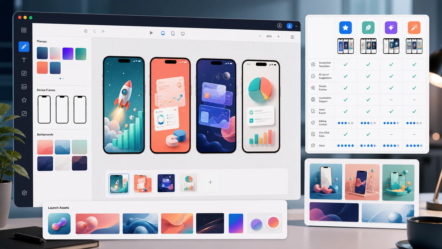
The 7 Best App Store Screenshot Generators in 2026 (Compared)
Compare AppLaunchFlow, AppScreens, Previewed, AppLaunchpad, Shotlingo, Figma, and Canva on AI help, editing control, store sizes, localization, and launch assets.
The 7 Best AI App Icon Generators in 2026 (Honest Comparison)
Compare AppLaunchFlow Icon Composer, Apple Icon Composer, Iconikai, Appicons.ai, Midjourney, Figma, and resize tools on editability, variants, and export quality.
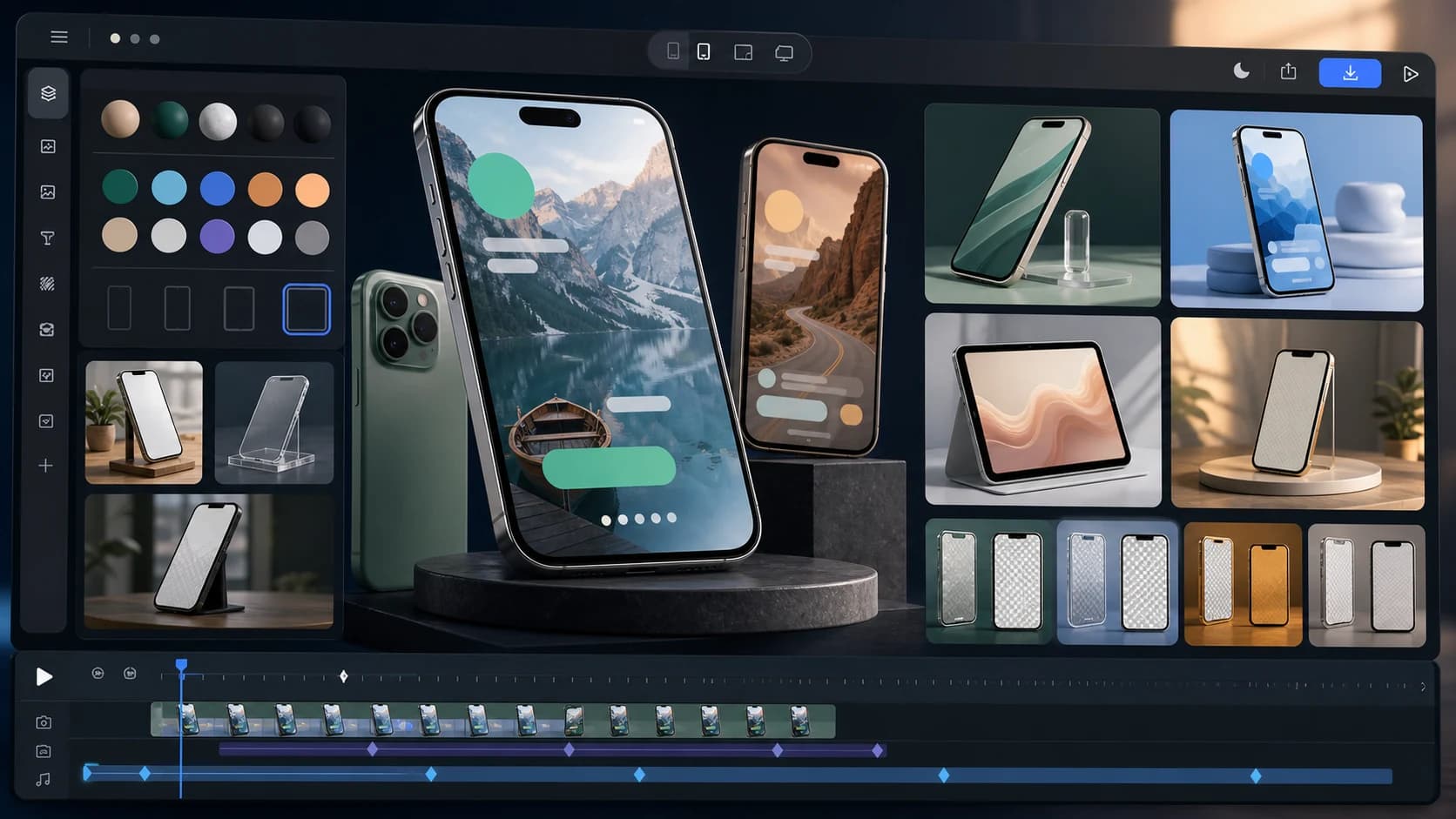
The 7 Best App Mockup Generators for App Launches in 2026
Compare static and animated app mockup tools for launches, including AppLaunchFlow, Rotato, Previewed, Smartmockups, Shots.so, Mockuuups Studio, and Figma.
App Store Screenshot Generator
Create iOS screenshots fast with AI and full editing control.
AI Screenshot Generator
Generate layouts and copy automatically, then refine them your way.
Ready to improve your store page?