Yannick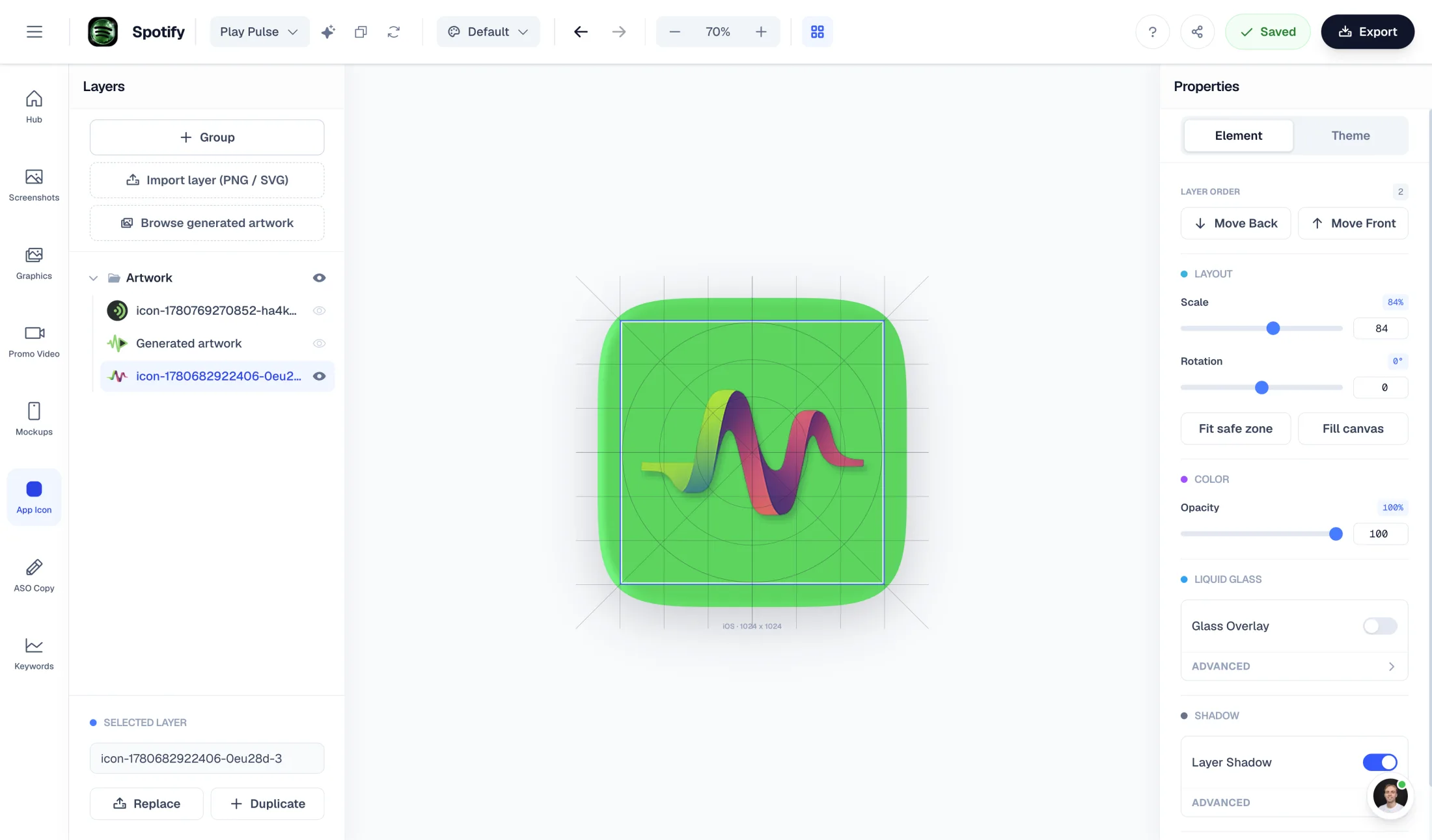
Design the master. Let the platform mask it.
Rounded in the interface. Unmasked at the source.
Separate your original artwork, runtime presentation and developer exports so one cosmetic fix does not break the final icon.
Design
Keep a clean square master and a recognizable central mark.
Inspect
Review masks, small sizes and contrasting backgrounds.
Export
Prepare flat store artwork or layered launcher resources deliberately.
An app icon can look rounded on a home screen without having rounded corners in its source file. Confusing those two jobs causes visible borders, double-rounded shapes and artwork that feels too small. The right fix is usually in the master, not in an extra rounded PNG export.
Quick answer
Keep Apple source artwork square and unmasked; the system handles its presentation. For Android adaptive icons, prepare separate foreground and background layers instead of baking a launcher mask into a single bitmap. Use a browser preview to inspect shape and legibility, then verify the final resources on devices.
Why your rounded PNG can look wrong
Imagine a blue icon with transparent corners. Placing that bitmap inside another rounded shape can reveal a light rim, shrink the recognizable mark, or create two different curves. A source designed for one presentation is now being masked again. Filling the transparent corners is not the same as redesigning the icon's silhouette.
Keep an untouched master and record which outputs are store listing artwork, application resources or marketing mockups. A rounded image in a blog or pitch deck is a presentation asset; it should never quietly replace the source used to generate the app's resources.
Inspect the master first, then use Icon Composer when the design needs a stronger mark or a new concept.
Three outputs that should not be confused
Use the output's job to choose the workflow. A size exporter helps when the design is finished. A preview helps decide whether that design survives a mask. A layered resource generator helps integrate it into a platform project. None of these automatically redesigns the mark.
| Job | Keep | Avoid |
|---|---|---|
| Apple source artwork | Square, unmasked artwork prepared for the relevant icon workflow | Baked corner transparency or a screenshot of a masked icon |
| Android adaptive launcher icon | Separate foreground/background and optional monochrome resources | A flat store-listing image renamed as adaptive |
| Marketing preview | A clearly labeled masked review or mockup | Submitting the review sheet as the icon source |
A practical 48px and 64px review
Start at actual size, not a zoomed design canvas. Can you recognize the core shape without reading a tiny label? Does a narrow stroke disappear? Does the silhouette still stand apart from adjacent colors? Review the same master on a light and a dark background before changing it.
A useful test is to hide the large preview and describe the small icon in one sentence. If the explanation depends on details you can no longer see, simplify the hierarchy. Keep one distinctive mark, reduce ornamental detail and compare revisions side by side. These are design checks, not evidence of a measured install-rate lift.
- Inspect at 48px and 64px on a normal-density presentation as well as your target devices.
- Check the original source alongside each approximate mask.
- Do not fix weak contrast by adding a border that only works on one wallpaper.
- Regenerate resource outputs after changing the master; do not patch exported sizes individually.
Android safe zones are not iOS corner padding
Android's adaptive format uses 108dp layers and a central 66dp safe zone. The outer area supports masking and motion, so important artwork needs room to survive different launchers. A background should cover the layer while the foreground carries the recognizable mark.
Use a transparent symbol for the foreground. If your uploaded logo already contains an opaque square background, that square stays part of the foreground unless you remove it in your design source. For themed output, provide a purposeful alpha silhouette rather than expecting automatic color conversion to understand the artwork.
From a preview to a development handoff
When the mark is settled, keep the original square master under version control or in your design source. Export the files required by your current project and inspect them in Xcode or Android Studio. Where layered appearances are needed, prepare those deliberately rather than treating a flattened PNG as equivalent.
AppLaunchFlow's free preview is a quick inspection step. The flat size generator handles a finished image's size handoff. Icon Composer is the route when the original design still needs concepts or editing. The local preview does not upload your file into Studio, so select the master again when you choose that separate workflow.
Continue the workflow
Primary sources and verification notes
Platform requirements and software capabilities change. These sources were reviewed for this guide on October 16, 2026; open the current source again before publishing assets, enabling production access, or standardizing a team workflow.
- Apple Human Interface Guidelines: App icons: Source artwork and platform presentation; verify the current platform-specific icon workflow.
- Android Developers: Adaptive icons: Separate layers, 108dp dimensions, safe zone and monochrome resources.
- Apple: Creating your product page: Recognizable icon design and legibility at different sizes.
App Icon Rounded Corners FAQ
Should an App Store icon have rounded corners in the source?
Keep the source square and unmasked for Apple's icon workflow. Do not submit a rounded marketing mockup or the preview tool's review sheet as the source icon.
Is there one correct Android corner radius?
No. Adaptive launcher masks vary by device and launcher. Design separate layers with the important mark inside the safe area and test on supported devices.
Can the free preview show the exact system appearance?
No. Its browser masks approximate shape and legibility only. Layered effects, launcher behavior and system rendering require device testing.